Would love feedback on two landing pages for a personal loan comparison website in Norway🇳🇴⭐
Hi😄
Thank you for letting me be a part of this community, I'm absolutely loving it so far!
🎨 So my agency is currently designing the landing pages for a personal loan and debt consolidation comparison website in Norway
Currently, the website has two types of landing pages: 1️⃣ Comparison tables, targeting keywords like "best personal loan", etc. or 2️⃣ A landing page with the intention of sending the user to a specific affiliate partner, targeting keywords like "how to consolidate credit card debt", etc.
1️⃣ As of now, the comparison pages look like this:
https://lånesiden.no/beste-forbrukslån/
Not too bad in my opinion, but I think several things could be done. For instance, we have been discussing adding some social proof above the fold and perhaps using emojis (pointing finger) on the CTA-buttons.
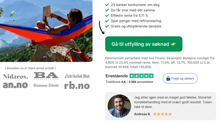
2️⃣ When it comes to the landing pages where the goal is to send the user to a specific affiliate partner, here is an example of how it looks:
https://lånesiden.no/refinansiering/
I'm a bit unsure of what to change here🤔 Important elements like social proof (testimonials and "as seen on"), a CTA-button that stands out, a relevant image, trust badges and decent copy are already there✅ Perhaps the design could be improved, though?
For the website in general, we are thinking that it might be a good idea to change the font. As of now, they are using a standard Google font called Inter.
Any ideas for what to change/implement? All feedback and input, both positive and negative, would be highly appreciated. Thank you!❤️
Please excuse my English if there are any mistakes. I'm a native Norwegian (trying my best).
