Would you convert? 2.0
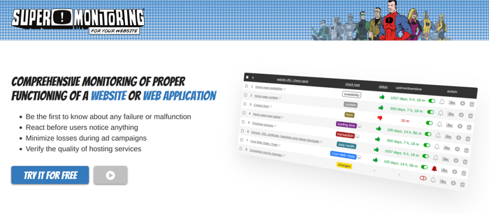
After your harsh but valuable feedback here, I created a new version of the landing page.
It would be great if you could look once again and provide some feedback.
P.S. I'm still not sure if hiding the navigation is a good idea. But on the other hand - if it wasn't hidden, the landing page wouldn't be much different from the website home page...

There was a concept but it's not done enough. I like the idea of superheroes as a part of a brand - adds some twists. But the visual aspect is lacking - too many headers, so the structure of information is lacking and I would like to see the superhero aspect really pop. There is not enough comic references to emphasise the idea.
Did you see the previous version, where they said there was too much superheroes? ;)
P.S. Superheroes is not a new concept, our brand has been using them since 2010. The landing page is just one of many implementations.
Hi. you've still got some issues, especially with the writing. They're a bit complex to jot down quickly here.
I'm happy to do you a free, short PDF content report, if you don't mind me using the report as an example product on my site. It should give you something to work with that can help improve what you've got.
Drop me a line via my contact form if you'd like some structured feedback on the writing. https://wordsonwebsites.co.uk/contact/
Cheers
Sakina
Done!
@catalystNewbie, @oliesaurus, @janar, @StanD, @WordsOnWebsites, @XCS could you spare a minute?
Am I late for party? Send me PM- I could spare a minute if still active request.
But I did. I literally responded in this thread that I could spare a minute. PM part can be dismissed.
Hi @janar. Why don't you respond here?