Would you help me improve my landing page conversion?
Hi 👋.
It seems my app’s lading page (https://ds9soft.com/popdo/) is not getting many conversions from visits to downloads. It may be attributed to people simply not interested in that sort of task list from the screenshot they see when they land, or it could be the copy, or something else, I really can’t tell.
I designed the landing myself with Blocs app and I admit I’m not a good designer. Would you give me your honest/cruel opinion? What should I change?

First thing I see from user perspective: it's not clear what is "Purchase" button, when I have "Free download"? What is difference?
Also, I think this model of trial software is not so good. It's better to have free & paid version.
Thank you for taking the time to write. It’s very common to offer a free download, perhaps I should rephrase that as Free Trial.
About the business model: freemium works for mobile, but I don’t think many use it for desktop software, particularly for this kind of apps, where there’s not much you can offer as a premium vs a free version. For a more complex application, I suppose a basic free version with pro IAP could work.
Try to rephrase it with "14 days free trial" or "Try for free" and below that button write "no credit card required", this should work better.
But, consider also, a better design for landing page. Here is just fast idea, how it can look and feel better.
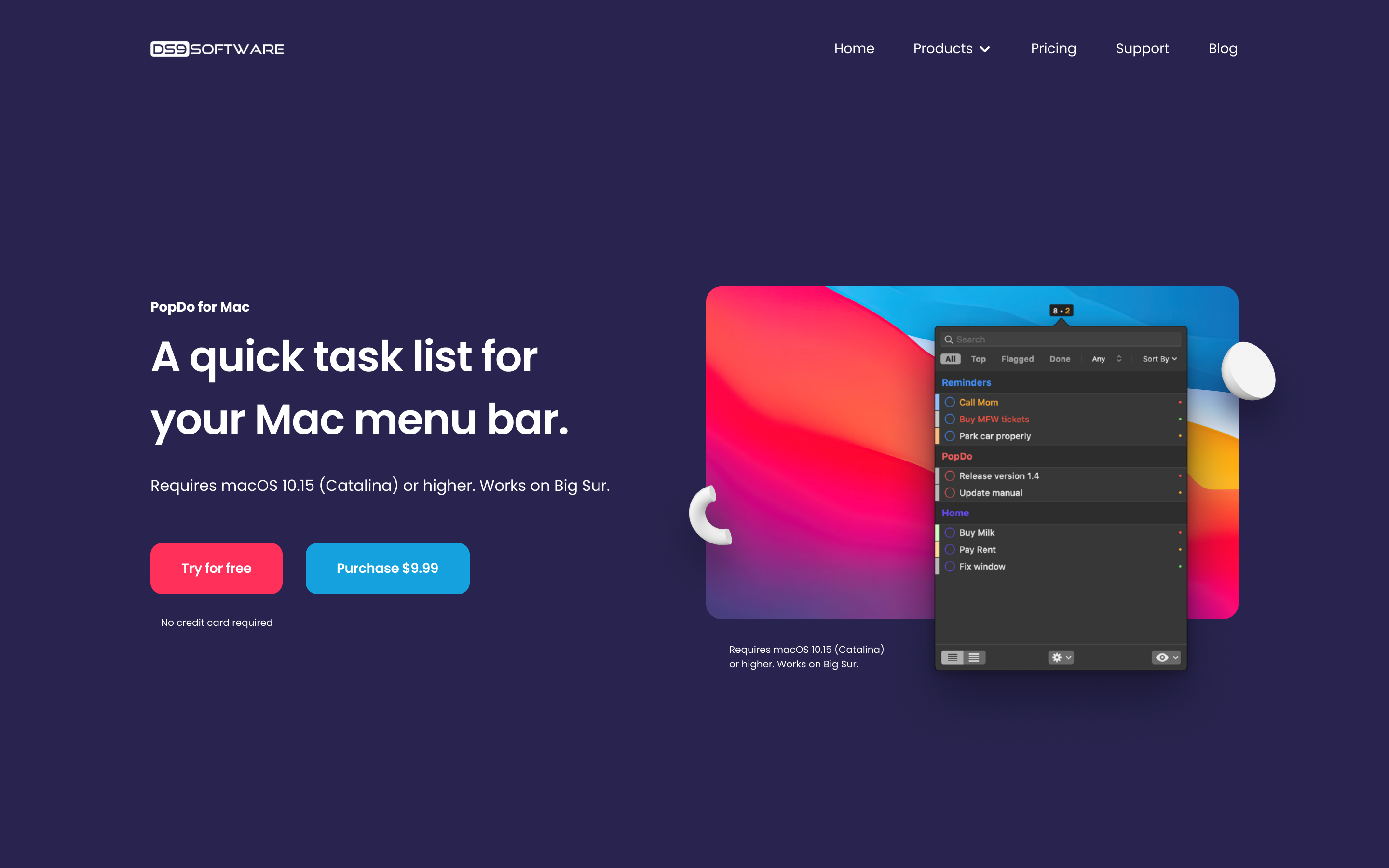
Oh that looks so nice! Thank you, I really suck at web design.