
AgileTask.ai
AI sprint planning for solo founders and indie hackers
Rebuilt the hero loop on agiletask.ai today across three deploys.
What shipped
Killed the grey container around the macBook window. The product now floats on the walnut canvas. The macOS chrome inside the recording is the only frame.
Swapped the 924 × 590 source for a fresh 1784 × 1080 capture at 1.2 Mbps. The old version was being upscaled around 2.5× by the browser, which is why text on the AI plan looked smudged on Retina. Razor sharp now.
Bumped the video clip radius to 16px so the macOS window's own rounded corners stay clean, and amplified the bronze glow behind it so the loop visibly lifts off the page instead of blending in.
Why it matters
The loop is the first proof a visitor sees that AgileTask is a real product, not a pitch deck. If the loop is blurry or sits inside a square grey tray, the "AI plans your sprint in 15 seconds" claim reads like marketing. Sharpness + a clean float makes the same claim feel like a demo.
Cost
About 3 hours, three deploys (v4.6.3 → v4.6.4 → v4.6.5). Zero new Sentry issues. No backend changes.
Stack notes for anyone tackling the same problem
Hero video files at the source resolution beat any amount of CSS polish. We upgraded the encoding (924 × 590 at 369 kbps → 1784 × 1080 at 1.2 Mbps). The blur was data, not styling.
Border-radius on the
<video>element needs to be tighter than the macOS chrome's own corners inside the recording, otherwise the OS window's light edge bleeds into the page background.For "lift off the canvas" effect: stacked radial gradients on a
::beforeplus a wide rim-glowbox-shadowon the video itself. Bronze rgba(207, 168, 106, 0.42) center, fading to transparent.
What's nextProduct is in a good place. Distribution is the only thing that matters now. Outbound, founder posts, a Product Hunt push, and a few partner placements are queued for the coming days. Updates soon.
Live: agiletask.ai

Yesterday I shipped v4.5.1.
It is the first version that feels like the right product. To get here I killed three earlier redesigns in 24 days:
Cadence · the rhythm-first concept that taught me to make time visible
Canvas · the infinite-canvas workspace that taught me spatial freedom is what designers like demoing, not what solo operators need
Ember · the vertical organizer that taught me focus has to be forced by the product, not offered as an option

v4.5.1 is a one-page sprint engine. Type one goal. AI drafts the five tasks that ship it. Today surfaces only the three that matter right now. Three goals hard cap, no paid tier that lifts it.
Where I am: 46 days into publishing this build openly. €19/month, $21 outside the EU. Target is $1,000 MRR by May 31, which is 15 days from this update. The next product update will say exactly where the meter is.
Full write-up with screenshots and the breaking-insight story in the long-form post.
Hi. Remember me? Probably not, which is fair, because the last time I posted here I think the iPhone was still 2 generations behind.
Quick lap of honor before I lower expectations: AgileTask is at day 30, 24 signups (16 of which are me testing my own checkout flow with different cards because apparently I don’t trust myself), and 0 paying customers. Real ones. Not the ones my Stripe dashboard kept counting as “active paying” until I noticed it was lying to my face.
That was actually one of the things I fixed this week. My admin endpoint was returning “MRR: 456 EUR” for two days straight and I almost believed it. I almost wrote a tweet. Imagine the screenshot. Imagine my dignity. The numbers were real. The customers were not. I now have real_* fields that subtract test accounts, which is a deeply humbling feature to write at 11pm on a Tuesday.
I also reversed a decision I had been very public about: the trial used to be card-free. Sign up, do nothing, bounce, no harm done. Beautiful funnel. Beautiful zero conversion. After 30 days of watching people sign up, never create a sprint, and disappear forever, I added the card requirement back. 14 days free, but you have to commit your card on day zero. Lower top of funnel, higher intent at every step after. The growth playbook says “reduce friction.” The data on my dashboard says “your funnel had no friction and also no customers.” So I picked the data.
We will see in 30 days whether this was clarity or cope. Place your bets.
What else have I been doing instead of posting here, you ask. Mostly the kind of work that nobody on the internet rewards but that you also can’t avoid forever:
I had three different services emailing my (theoretical) customers about their (theoretical) failed payments. Stripe was sending one. Postmark was sending one. Loops was sending one. All for the same event. A non-existent customer would have received three emails for one payment failure. I fixed it. Stripe handles billing now, the others handle their actual jobs, and the imaginary customer can finally rest.
I gave Stripe its own subdomain (billing.agiletask.ai) which required logging into Cloudflare, which required first remembering I had a Cloudflare account, which required resetting a password the agency I worked with had set and never told me about. My security posture is impeccable.
I rebuilt the top bar in the app because the logo had “AgileTask” with the word “Task” in blue for reasons I can no longer explain to a sober person. The four buttons in the header were four different heights. Four. The search field was a pill in a sea of rectangles. I noticed all of this in the same week, which suggests I was either having a lucid moment or a crisis, possibly both.
Dark mode was failing accessibility contrast on raised surfaces, which is a sentence I now type fluently and which would have meant nothing to me 6 months ago. The card titles were ghosting into the background. I fixed that too. The Board view was rendering Priority columns as flat grey rectangles instead of using the priority colors I had literally already defined. Two-line fix. Eighteen months of staring at it.
Between all this I shipped v4.3.2 and v4.3.3, which is the kind of version-number escalation that suggests progress and also that I have not had a single conversation with a paying customer because there isn’t one.
Which, fine. The lesson part:
Polish is a comfortable place to hide. So is “no card required.” Both feel generous. Both are also extremely good ways to never find out whether anyone actually wants to pay you. The product is good enough. The funnel is what’s broken, and the funnel is broken because I keep choosing CSS over conversations and frictionless signup over frictionless honesty. Tomorrow I have to do the thing I have been avoiding for 30 consecutive days, which is talk to actual humans about whether they want to pay for this. Cold DMs. A real launch post on this very site. I will probably hate every minute. I will definitely do it anyway.
If you’ve ever opened Notion on Monday with the noble intention of “planning the week” and closed it on Friday having shipped exactly nothing: I made AgileTask for you. It turns one sentence about what you want to ship into an actual sprint with the actual tasks. It is currently the best-designed product nobody is paying for.
If that resonates, two things you can do for me:
1. Tell me, brutally, what’s stopping solo founders like you from trying something like this. The card on day zero, specifically: dealbreaker, fair, or “finally, someone serious”? Reply here, I will read every comment with a level of attention that is mildly unhealthy.
2. Or just try it: agiletask.ai. 14 days free, card required, Pro is 15 EUR a month after. If it doesn’t fit, cancel before day 14 and tell me why so I can stop building the wrong thing.
I’ll be back next week with either good news, worse news, or a third version bump nobody asked for. Probably all three.
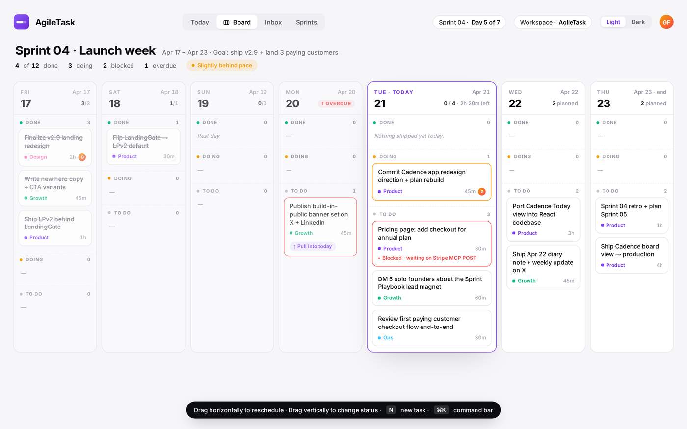
Today I shipped the biggest update of the build so far: Cadence v3.0 — a full redesign of the app shell around a new daily rhythm. Sidebar, ⌘K command bar, Inbox + ⌘⇧A quick-capture, Daily Log, morning brief.
This post is half build-log, half honest reflection, because I think I made a real mistake this week and I want to name it before I forget.
What I shipped (72 hours of work)
Phase 3 — new shell
- Persistent sidebar with Today / Inbox / Board / Sprints
- ⌘K command bar — jump anywhere, capture anything
- Dark mode (no position: fixed theme toggle, thank you)

Phase 3.5a — Daily Log
- End-of-day retrospective that takes 2 minutes
- Three prompts: what I shipped, what blocked me, lesson worth keeping
- "Tomorrow's top 3" field auto-seeds the next morning's brief
- Lives as a dockable side-sheet, not a modal I'll avoid
Phase 3.5b — Inbox + ⌘⇧A
- Global ⌘⇧A quick-capture palette (title only, ↵ saves)
- /inbox page for triage: Send to active sprint / Defer / Delete
- Live badge count in sidebar via an event bus

The real insight
Every productivity tool asks you the same question every morning: "what do you want to do today?"
That is the wrong question. When you're a solo founder, choice is the enemy. The right question is: "what is the ONE thing that moves this sprint forward today — and what do I ignore?"
Cadence's Today screen has one dominant element: the active sprint and its progress. Everything else is folded away until you need it. ⌘K to navigate. ⌘⇧A to capture. Daily Log at 6pm. Morning brief at 7am. A rhythm, not a backlog.
What I got wrong
Here's the part I don't want to write.
In those 72 hours I made zero posts. No X. No LinkedIn. No outreach. No DMs. I told myself I'd post when the feature was "ready."
Result: zero new signups this week. Zero new MRR. My charts are flat.
The shell is beautiful. Nobody knows.
Build half, distribute half. Every time I forget this, I lose a week. I'm writing it here so I can't pretend I didn't know.
What's next
Today/tomorrow — distribution mode.
- Post this article + X thread + LinkedIn version
- Reach out to 5 solo founders personally with the Cadence V3.0.0 walkthrough
- No code before 13:00 tomorrow
Phase 3.5c — Goals (this week).
Macro goal sits above the sprint. Sprints roll up to it. Everything ladders to a single number you care about this quarter.
Phase 4 — Board view (next week).
Time-lane visualization so the week is legible at a glance.
If you're building solo
The private beta is open at agiletask.ai. I'm looking for 10 solo founders who'll actually use it and tell me what sucks. DM me "cadence" on X (@AgileTask_) or comment here and I'll personally walk you through the setup.
What I'd love to know from you:
1. What's the ONE thing that kills your solo-founder workflow on a bad day?
2. Which tool surprised you by being simpler than you expected?
Thanks for reading.
Go as far as you can see, and when you get there, you will see further.

Solo founder update. Working on AgileTask.ai — an AI sprint planner for founders and small teams who hate project-management admin.
Still pre-revenue. Early traction is weak. Instead of waiting for distribution to kick in, I spent this morning attacking the product itself: polish, friction, and the stuff users looked confused about in recordings.
Four versions shipped in ~6 hours. Writing it up here because each one came from a real observation, not from a roadmap.
v2.4.4 — Calmer board
What users were doing: Collapsing every column to see the whole board, then expanding one by one to peek inside. Pure friction.
What I shipped:
Hover a collapsed column chip for half a second → a little card floats up with the top 3 tasks, priority dots, "+ N more" count
Soft indigo radial gradient on the board background instead of flat grey
Replaced the bare back-arrow with a real Workspace / Project breadcrumb
When every column is collapsed, a quiet coaching line appears: "All columns collapsed. Click any chip to expand it, or drag tasks onto one."
Tiny stuff. All together it made the board feel like a place instead of a spreadsheet.
v2.4.5 — Delight + momentum
I keep seeing "gamification" dismissed as a marketing gimmick. In a productivity tool it's different: users need emotional payoff when they finish work, or the product feels like homework.
What I shipped:
Sprint progress ring in the board header: 28px SVG ring, indigo fill that grows as you complete tasks, turns emerald at 100%
Focus Mode (press F or click the maximize icon): dims the breadcrumb, header actions, and Add List button. Remembered per project in localStorage.
Confetti when a task is dropped into Done (or its status flipped to Done). 18 particles, drops where you dropped. No toast, no sound — just a quiet "you shipped something"
All of it respects OS Reduce Motion (confetti becomes a halo, ring skips the sweep)
The confetti took 90 minutes. My dopamine-per-done-task went up 10x. That's a win worth 90 minutes.
v2.4.6 — Integrations, redesigned
The integrations page was chaotic — uneven columns, purple CONNECT buttons shouting, no connected counter, no search. Typical early-stage SaaS "we ship features faster than we can organize them" page.
What I shipped:
One unified grid, consistent card sizes
Toolbar with instant search + category chips (All, Communication, Automation, Development, Productivity, AI) with live counts
connected / totalcounter pill in the page header (small but it reframes the whole page from "list of tools" → "what have I actually set up?")Three card states: Available / Connected (soft emerald accent + check) / On the roadmap
Buttons no longer shout: subtle outline by default, indigo fill only on hover
Added Perplexity to the roadmap — one-click research on any task. "Notify me when ready" ships via mailto, no backend. Pure signal-gathering without building the plumbing first.
The Perplexity add is a small bet: let users tell me if they actually want it before I build the integration. If 20 people click Notify, I build it. If 2 people click, I don't.
v2.4.7 — The bug that almost shipped
Hour six, a user caught this: clicking the sprint name pill silently set a sprint filter, which lit up the filter icon with a "1" badge, with zero visible explanation. Opening the filter panel showed… a mostly transparent popover (rgba(0,0,0,0.02) background 🤦) floating over the Done column, with the sprint filter section buried at the bottom.
Classic: you ship something, it technically works, and the user has no mental model for why the UI is reacting.
What I shipped:
Sprint pill now shows it's filtering: indigo border, soft glow, inline X to clear. The link between the pill and the filter icon is now visually obvious.
Sprint pill is a toggle: click once to filter, click again to clear.
Filter popover has an opaque background with a real drop shadow.
Active-filter summary chips at the top of the popover — every current filter is listed as a clickable chip. Click any chip to clear just that one.
The lesson I keep relearning: silent state changes are always a bug, even when the product works. If the UI reacts to a click, the reaction has to be visible at the click site, not three icons away.
What this looked like as a workday
4 commits
3 new components (Confetti, SprintProgressRing, new IntegrationCard)
1 bug caught by a user inside the hour and fixed in 30 min
0 new users
Still zero on the revenue side. Still worth it — because every one of these changes came from actually watching someone use the product (including me) and feeling the friction.
Pre-revenue is the one time you can optimize pure product without the distraction of protecting existing MRR. I'm going to keep shipping at this pace until the product stops making me flinch.
Ask
Two things I'd love feedback on:
For those running a solo SaaS pre-revenue — how long did you polish before switching full-time to distribution? I feel the pull both ways.
The Perplexity "notify me" pattern (ship the waitlist before the integration) — anyone else done this? Did it actually signal demand, or just collect dead emails?
Live at agiletask.ai if you want to poke at it. Happy to answer anything in the comments.
Stage: solo founder, 1 real user (me), €0 MRR, rebuilding the foundation before chasing growth.
For the last few months, AgileTask.ai was living inside an Emergent wrapper. It was the fastest way to get a working product on the internet. It was also the main reason I couldn't ship anything that actually moved the needle.
This week I ripped it out.
Here's what broke the camel's back, what the new setup looks like, and why I think solo founders in 2026 should seriously consider running their own stack with an AI agent as the second pair of hands.
What wasn't working with Emergent
- Black box hosting. When something broke, I couldn't reach into logs, DNS, queues, or the DB the way a real operator needs to. I was always one abstraction removed from my own product.
- Email deliverability was a ghost. Password reset emails silently failed for days. The reset endpoint was literally returning the temp password in the API response instead of sending an email. I only found it because I tried my own forgot-password flow.
- Analytics was three overlapping tools (Plausible, Humblytics, Crisp) fighting for the same signal, none of them trustworthy.
- I couldn't attach my own domain cleanly. Users landing on an emergent.sh preview URL is not a product. It's a demo.
- Every "small" fix required waiting on a platform. For a solo founder, that's lethal.
This is not a dunk on Emergent, it's a great tool to go from idea to running product in a weekend. But the moment you're serious about customers, email, SEO, and real ops, you need to own the stack.
The new architecture (all independent, all mine)
- Web: Vercel
- API: Railway
- DNS + edge: Cloudflare
- Data: MongoDB Atlas
- Email: Postmark (SPF + DKIM + DMARC aligned)
- Error tracking: Sentry
- Analytics: PostHog — one source of truth, killed Plausible + Humblytics + Crisp
- Source of truth: GitHub, feature branches, PRs into main, Vercel auto-deploy on merge
Nothing exotic. All boring, all proven, all independently swappable.
The part that actually changed the game: AI agent as orchestrator
This is the piece I didn't expect.
I'm running Perplexity Computer (the agent) as my second pair of hands, full-time. Not as an autocomplete, not as a chat window, as an orchestrator that actually operates the business.
In the last 48 hours it has:
- Opened and merged 3 PRs (removing legacy analytics, fixing the password-reset endpoint, hardening observability)
- Run direct mongosh commands against production to clean out a sample dataset that was leaking "fake users" into my metrics
- Managed my Postmark suppression list and verified bounces
- Triaged Sentry issues
- Updated the changelog in the app itself so users can see what shipped
- Wrote today's diary entry and tomorrow's top-3 TO DO as Apple Notes, mirrored to my email, on a daily cron
I write the intent in plain English. It executes across GitHub, Railway, Vercel, MongoDB, Postmark, Sentry, PostHog, Mail, Apple Notes. Every action is logged. If it screws up, I roll back the PR.
Net effect: I'm a solo founder with the shipping cadence of a 3-person team, and zero platform lock-in.
What this means for AgileTask's users
- Password reset actually works now
- Emails come from support@agiletask.ai with proper auth (no more spam folder)
- The product lives on its own domain, owned by me
- The changelog page (`/changelog` in-app) is now updated on every real change, not every few weeks
- The next phase is distribution, not infrastructure. Finally.
What I'd tell another solo founder
1. Ship on a wrapper to validate. Leave the wrapper the day you have a single real user who depends on email, DNS, or data integrity.
2. Pick boring, swappable infrastructure. Vercel + Railway + Cloudflare + Atlas + Postmark + Sentry + PostHog is fine for 99% of us.
3. Hire the agent. Seriously. The leverage of a capable AI orchestrator with access to your actual tools is bigger than any "AI feature" you'll build into your own product this year.
4. Write a runbook. Even if only you and the agent read it.
Next week I'm back to founder-led distribution: build-in-public, warm outreach, and turning promo codes into real conversations. Updates coming.
Big thanks to two people who gave me useful pushback while I was figuring this out: @nick and @koru — this one's for you. Follow-up email incoming.
If you're a solo founder who just moved off a platform wrapper or is thinking about it, I'd genuinely like to hear how you decided. Reply here.
— Giuseppe, building AgileTask.ai
-
1
Quick question — during all of that, did you ever notice parts of the system behaving inconsistently over time even when nothing obvious changed?
I’ve been seeing that pattern a lot with AI-driven setups.
Working on something that stabilizes that kind of drift underneath systems — not replacing anything, just keeping behavior consistent.
Curious if you ran into that at all.
-
1
Honestly no; my comment was about validation and delegation, not anything AI-infra related, so I don't have a useful data point for you here.
Good luck with what you're building though. If you have a concrete example of the drift pattern you're solving, I'd read it. Right now it's a bit abstract for me to react to.
-
1
Totally fair — that’s on me for keeping it abstract.
Here’s a simple real-world drift pattern:
You have a workflow or agent that’s working correctly at first — outputs are aligned, decisions make sense.
Then over time:
small context changes stack up
retries / patches get added
state gets slightly inconsistent
Nothing “breaks,” but:
outputs get less consistent
decisions start contradicting earlier ones
edge cases behave differently each run
So you end up babysitting it or patching it instead of trusting it.
What I’m building is basically a layer that:
detects that deviation from the original “correct state”
stabilizes it
and brings it back to a known-good behavior automatically
Not a full agent system — more like a stability layer that sits underneath.
If that’s not something you’ve run into, totally makes sense why it sounded abstract.
-
1
It works 95% of the time… but that 5% forces you to stop everything and fix it.
-
-

Spent most of today polishing the AgileTask landing page.
Big lesson: a page can look good and still fail to explain the product.
So today was less about “making it prettier” and more about making the value obvious in a few seconds.
What changed today
1) Sharpened the hero
kept the pain-led angle
made the solution more explicit
clarified that AgileTask turns a rough goal into a prioritized sprint in seconds
2) Reintroduced softer conversion
brought back the solo-founder lead magnet
gives colder visitors a reason to engage even if they are not ready to start a trial
3) Improved product proof
replaced abstract visuals with real product screenshots
added a clearer “idea → sprint” explanation flow
used a real sprint-generation screenshot for the “Clarity over complexity” section
4) Refined the 3-step narrative
tightened the sequence:
Describe your goal
AgileTask structures the work
Review and add to your board
improved readability and contrast
started polishing the section so it feels more like guided product comprehension than generic marketing
5) Added trust signals
strengthened the trial / no-credit-card messaging
explored adding a “sprints generated” counter to reinforce traction near the CTA
6) Cleaned up pricing
improved CTA copy on plans
fixed badge contrast issues
adjusted alignment and visual consistency
7) Upgraded the visual system
moved from a warmer purple toward a cooler bluish-violet accent
the page now feels calmer, more premium, and more software-like
What I learned
The biggest insight from today:
Good design is not the same as clear positioning.
The page got better when I stopped trying to make it “impressive” and started making it easier to understand:
what the product does
who it is for
why it is different from Jira / ClickUp-style complexity
Still left to fix
D I S T R I B U T I O N!
But overall this was a big step forward.
The landing page now feels much closer to the product I actually want to build:
clear, fast, calm, and execution-focused.
Curious what other founders optimize first on their landing pages:
clarity, trust, or aesthetics?
Big one: 55x analytics speedup (6841ms to 124ms). Added MongoDB indexes and replaced 14 sequential queries with one aggregation pipeline.
Also shipped: collapsible kanban columns, time-grouped My Tasks (Overdue/Today/Upcoming), empty states that prompt sprint generation, landing page "How it works" section, and a pain stat that lands better than any feature list.
Still at €0 MRR. 1 trial user. 14 days left in April to hit €3,000.
The product is getting sharper. Distribution is the gap.
-
2
1 trial user on day 14 is a big deal. that means someone looked at it and thought "i want to try this." most products never get that far.
distribution is tough, i feel that. but you have proof someone wants what you built. that matters.
-
1
really appreciated your comment earlier, it stuck with me.
I'm at the stage where i’m trying to validate whether AgileTask genuinely helps solo builders, or whether i still need to reshape the product.
if you’d be up for trying it, i’d be happy to give you a free month in exchange for candid feedback. if anything feels off, unclear, or unnecessary, I’d genuinely want to hear it.
if that sounds interesting, reply here and I’ll get you set up.
-
2
that means a lot.
i'd love to try it out. i'm building solo right now too so i'm literally the target user. happy to give you honest feedback on what works and what doesn't.
let's do it, set me up!
-
1
love it! thank you.
you’re exactly the kind of user i want feedback from.
just send me the email you want to use for AgileTask, or sign up at agiletask.ai and tell me which email you used, and i’ll get your free month set up.
and please be brutally honest once you’re in — what’s confusing, what’s useful, what feels off. that feedback is gold for me right now.
-
1
signed up — korumono2929@gmail.com. will come back with honest feedback after a few days of using it.
-
-
-
-

A fellow builder from this community signed up, found a bug during onboarding, and told me about it.I fixed it the same day and gave them 2 months free.
That's the whole build-in-public loop working as intended.
Zero marketing budget. Zero ad spend. Just showing up here every day and fixing what's broken.
Still at €0 MRR. 1 trial user. 10 days in.
This week's signal: visit duration jumped from 54 seconds to 7 minutes on the same traffic. What changed: added testimonials (Thank you!), fixed the comparison table, improved the signup form.
One of those three moved the needle. Still figuring out which one.
Also removed Google OAuth — "Sign in to emergentagent.com" was killing trust. Email/password only now. Cleaner.
€0 MRR. Still building.
agiletask.ai/playbook (free for builders)
Comment