Added a landing page thanks to your feedback
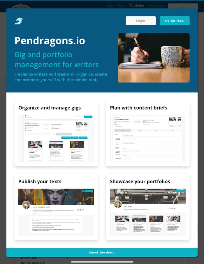
I listened to the Indiehackers and added a landing page to pendragons.io. It is implemented as a popup that displays to logged-out visitors. Simple and minimalistic.
I hope the purpose of the product is more evident now. Thank you all for the suggestions!

Looks pretty good!
Also, it’s not really a landing page, or at least it doesn’t feel like one. When visiting your website, it feels like a cookie popup on top of a landing page popup on top of the actual page. I’d like a true landing page, not popups.
----
I would encourage you to read a couple design books. If you finish those, there’s always more resources. These will help you with designing your admin pages and improving your typography.
I only recommend this design advice because writing complements typography, no? If you look at sites like medium, they really took the time to present the information in the most structured and beautiful way possible (until advertisers and stakeholders told them to prioritize account creation, pro features, etc.). Check out other sites that focus on distraction-free reading and writing:
A website is 90% text. Your website, an even higher %. I want a beautiful experience for reading and writing.
----
So, more feedback.
Believe it or not, the most important information is not your company name. Make the name smaller and move it up next to your logo. Instead, highlight your tagline, “Gig and portfolio management for writers”. Add CTA buttons to signup or try the demo.
Your screenshots are really too small to read unless you open them in a lightbox. Can you highlight a section or portion or mobile version rather than the entire page? Or, can you change the layout so that the images can be larger? If you want to get crazy, you can even illustrate.
The card descriptions are
font-weight: 600, when they should probably be aroundfont-weight: 400. The font itself—Open Sans—is common and overused on the web in general. Find or buy better fonts.Alignment is off—“Maja at Pendragons.io” does not align with the paragraph “Welcome to the Pendragons' application”. The placement of the social icons doesn’t feel right either.
The text is too stretchy. The paragraph “Welcome to the Pendragons' application” and form fields on the page screenshot titled “Plan with content briefs” grow wider than comfortable reading lengths.
For displaying lists of articles, they don’t always have to be rows and rows of the same card. Check out other examples for more engaging layouts, e.g. InVision and FastCompany. Also, the extra-wide card images here and the shadows on shadows feel off.
On the page screenshot titled “Plan with content briefs”, try thinking outside the database.
---
Anyway, I don’t have time to critique everything—that’s part of my day job haha just scratching the surface.
I give this feedback as constructive criticism; don’t feel bad about it. I will say, your site already looks better than most common templates. But, I feel like there’s potential to take it to the next level.
Oh, thanks so much! I really appreciate your in-depth comments. They really means a lot to me and I will study and follow them to the letter.