“Australia gives you +266€/month vs Germany” – why we stopped building dashboards
Hey everyone,
we recently posted a simple line:
“Australia gives you +266€/month vs Germany”
And it got more engagement than most of our feature explanations.
Why?
Because it answers the only question that really matters:
👉 What do I actually have left at the end of the month?
The problem we had
We built a product with:
tax calculators
cost-of-living comparisons
budget tools
Each piece worked well.
But users still struggled to make decisions.
They saw:
lots of data
lots of comparisons
But no clear conclusion.
The key realization
Most tools focus on:
income
price levels
rankings
But real decisions are based on:
👉 available income after everything
What we changed
We started combining:
net income
rent
grocery costs
health costs
Into one single number:
👉 what’s actually left
Example
Instead of saying:
“Australia has higher salaries”
“Germany is cheaper”
We now say:
“Australia gives you +266€/month vs Germany”
That’s it.
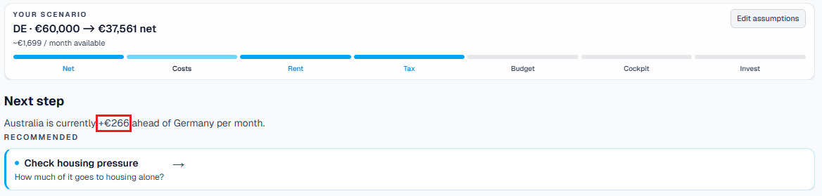
Why this works better
Because it:
removes interpretation effort
combines multiple variables
directly supports a decision
Product impact
This shift pushed us to rethink the entire UX:
From:
multiple tools
dashboards
exploration
To:
👉 a step-by-step decision flow
Where every page answers:
where you are
what it means
what to do next
What we’re learning
Users don’t want more data
They want less ambiguity
And often:
👉 one number is more powerful than ten charts
Would love feedback:
Do you think reducing everything to a single “available income” number makes sense?
Or does it oversimplify too much?

