Beyond the Swatch: Why a Great Palette is Your Project's Secret Language
We often get lost in picking individual colors. We find a beautiful blue (#1976D2) and a clean green (#28a745). But alone, they’re just notes. A palette is the melody.
On Huesnatch, the palettes page (huesnatch.com/palettes.html) is designed to be more than just a collection of colors. It’s a tool to solve a fundamental creative challenge: building a cohesive visual world.
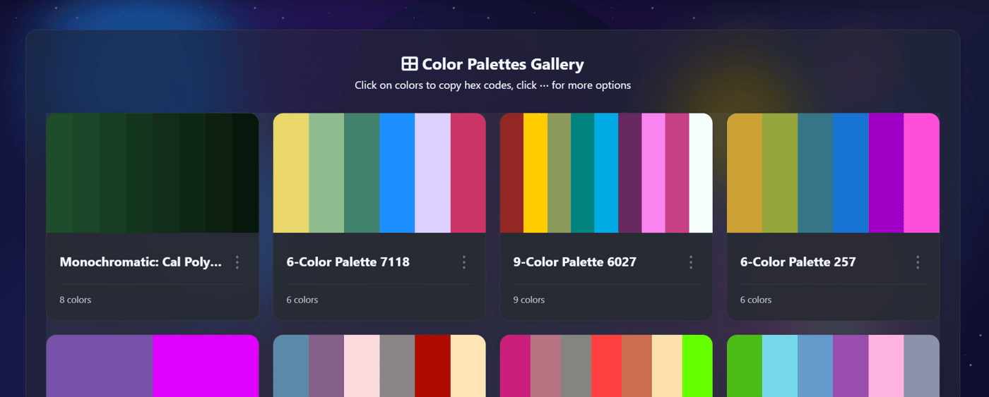
Why You Feel the Need for a Palette (Even if You Don't Know It Yet)
Every project tells a story, and a palette sets its tone, mood, and logic. Without it, you face:
Visual Chaos: Colors clash, hierarchy collapses, and the user feels disoriented.
Inefficient Workflow: You waste hours searching for "that one green" instead of designing.
Inaccessible Designs: You might unintentionally choose colors with poor contrast, leaving users behind.
Where to Use a Well-Crafted Palette (Your Benefits)
A strong palette from Huesnatch becomes your project's backbone, ensuring consistency everywhere:
Brand Identity: Establish trust instantly with a signature, memorable color system used across your logo, website, and marketing materials. It builds instant recognition.
UI/UX Design: Create clear visual hierarchies. A defined primary color for actions, a secondary for accents, and neutrals for text make your interface intuitive and easy to navigate.
Presentation & Communication: Whether it's a pitch deck or a social media graphic, a unified palette makes your ideas look polished and professional, helping your message land with impact.
Development Handoff: Exporting a palette as CSS or Tailwind config means developers implement the exact vision, with zero back-and-forth on "what color did you mean here?"
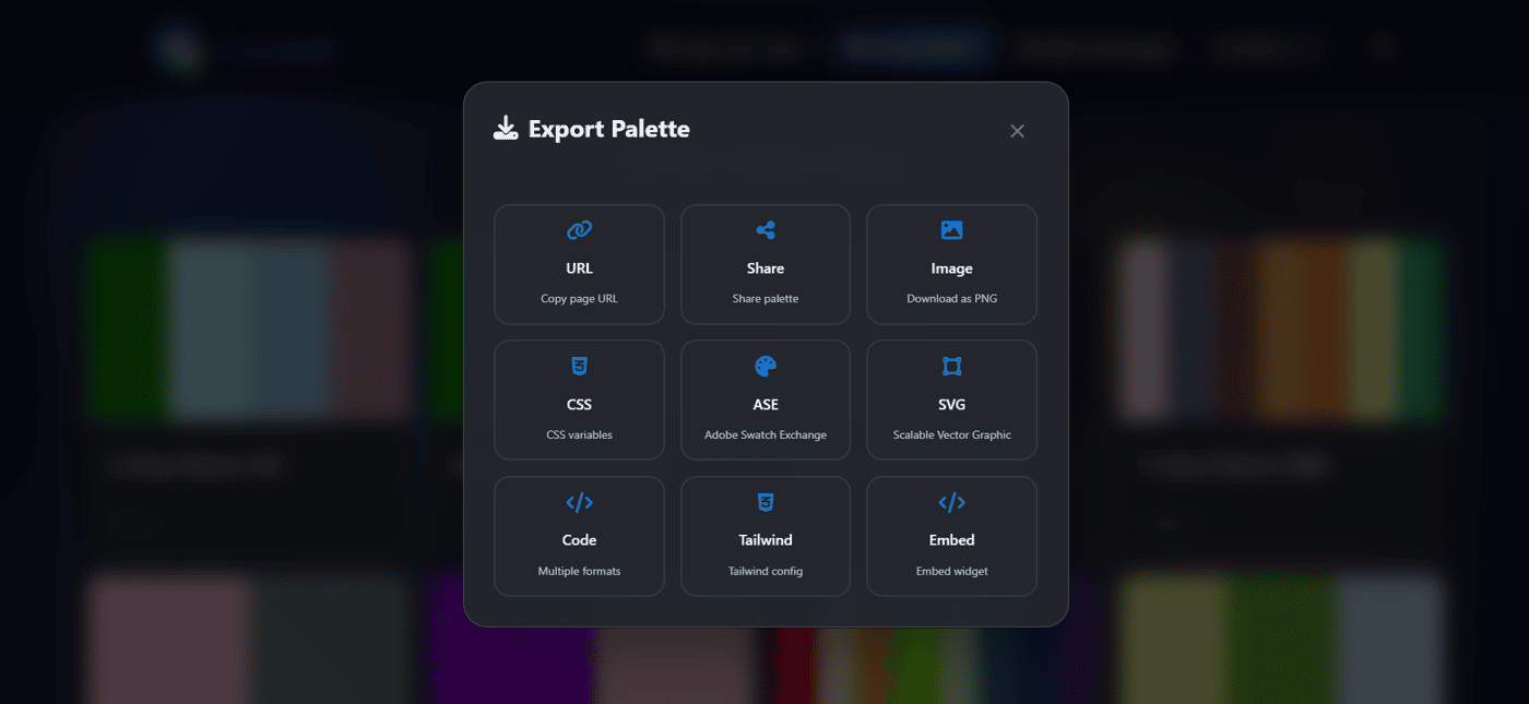
The Huesnatch Difference: Authenticity in Action
What I love about our palettes tool is that it's built on the same principles you see across Huesnatch:
It's for Everyone: Just like our Color Blind Simulator reminds us to design inclusively, our palettes encourage you to build with contrast and accessibility in mind from the start.
It's Practical: You can explore combinations, get the details, and then download your favorite palettes as images instantly. No account, no friction. This isn't just inspiration; it's ready-to-use fuel for your next project.
I built this page because I believe your creative flow should never be interrupted. A great palette is the shortcut to better design. Go build something colorful.
Tags: #ColorPalettes #UIDesign #WebDesign #Branding #DesignTools #Huesnatch #ColorTheory #FreeDesignTools #DesignWorkflow


This is a great point! Visual consistency and color theory are so often overlooked in early-stage presentations. A cohesive palette doesn't just look better; it builds trust and makes the narrative much easier to follow. I'm actually running a $299 special this week for professional, custom investor-ready designs if you want to skip the DIY struggle and focus on your pitch. Keep up the great work on Huesnatch!
When building anything these days, I find myself asking Claude to experiment with a handful of palettes and enable UI to allow me to see them all in action. Fun way to see it all in one place and also show other people to get feedback. Would’ve taken forever before but it’s such a neat way to nail such an important part of the process
Minecraft keeps evolving with frequent "game drops" and patches. The Minecraft 26.0 patch (also known as Bedrock Edition 1.26.0), released February 10, 2026, marks a major milestone as the first update under Mojang's new year-based versioning system. Versions in 2026 start with "26" for both Bedrock and Java Editions, making updates easier to track.