Built a personal finance tracker because I was sick of Google Sheets breaking on me
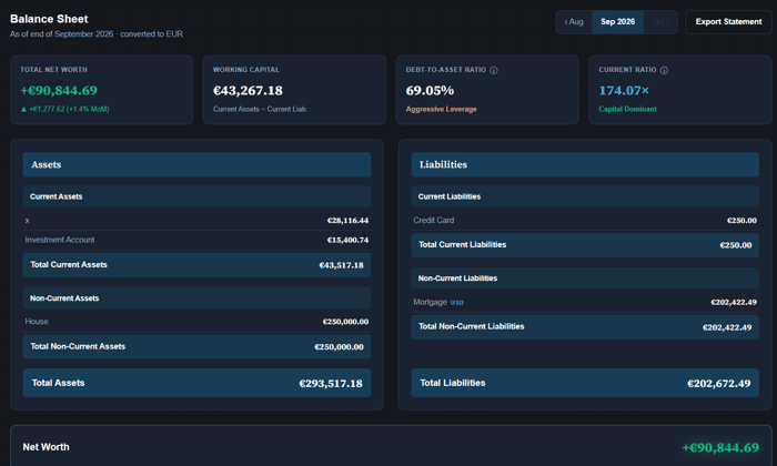
Solo dev, based in the Netherlands. Personal finance is a bit of a hobby for me, and I got fed up maintaining my own tracking in Google Sheets — formulas breaking, no real dashboard, just a wall of numbers I never fully trusted. So I built FiscoTrail.
It covers budgets, transactions, investments, and net worth. Works great with one currency (most people), also handles multiple if you need it — I didn't want to build it around any one country. There's a FIRE planner too, one that actually factors in things like loan payoff timing rather than just a flat withdrawal rule.
It's live now at fiscotrail.com. Core stuff is free and staying that way — planning paid features later for people who want more, but not rushing that until I actually understand what people find valuable.
Right now I'm just trying to get real usage and feedback before I think about pricing at all. If you've got multiple accounts or currencies to juggle, or you're just tired of your own spreadsheet, I'd love for you to try it and tell me what's confusing or missing. No bank connection needed, users are in full control of the data they enter.

This is a good example of a product starting from a repeated personal frustration rather than a feature idea. I’d be curious to know which specific spreadsheet failure finally pushed you to build it—manual categorization, broken formulas, or the difficulty of using it on mobile?
Honestly the biggest one was the manual setup every month — I had to do a bunch of prep work just to be ready to start entering data, before I'd even logged a single transaction. But the real breaking point was adding a new account or expense category. Every time, I had to go through and make sure every formula that touched that category actually picked it up correctly — miss one and a number would just quietly be wrong somewhere, and you wouldn't necessarily notice for a while.
Funny enough, I'm actually still running FiscoTrail and the old Google Sheet in parallel right now, just to double check I'm not missing anything the spreadsheet used to catch. So far it's holding up — planning to finally retire the spreadsheet for good soon.
Waiting on pricing until you understand what people value sounds careful, but free users of a finance tool will never teach you what someone is willing to pay. Put a price on the FIRE planner now, even a wrong one, because the fastest signal you can get is who reaches for a card. Personal finance is one of the few categories where people already pay for spreadsheets, so charging early is less risky than it feels.
Fair challenge, and I think you're right that free usage alone won't tell me what people are willing to pay — that's a real gap in my thinking. Two reasons I'm still holding off though: first, this handles real financial data, so I want the legal/compliance side solid before money changes hands, not just before signups. Second, and maybe the bigger one — I'm still very early, trying to get to the first 100 real, recurring users. A price signal from 15-20 early adopters wouldn't tell me much; I'd rather know there's genuine interest in the free product first, then introduce pricing once there's an actual base to read signal from.
That said, your point still stands that free users alone won't teach me willingness to pay — so I could put a price on the FIRE planner now as a "coming soon" with a waitlist, just to start collecting that signal without needing full billing built yet. Might do that in parallel. Appreciate the pushback, this is exactly the kind of comment I was hoping this post would get.
Solid first version — especially the ratios in the balance sheet, with debt-to-asset and current ratio front and center instead of buried in a report somewhere. Bookmarking to try with my own accounts.
I would really appreciate if you try it out, and looking forward for your feedback. I am testing this with my own numbers for a longer time, but everyone's financial setup is a bit different, so those kind of feedbacks are highly valued.
The manual-entry constraint is interesting because it makes trust a feature rather than a missing integration. I’ve found the first useful question is not “what should the dashboard show?” but “what decision do I want to make this week?” A small weekly review with one or two changes surfaced might be more habit-forming than another dense overview. How are you thinking about helping users get from the numbers to that decision?
Honestly, right now it's more numbers-dump than decision-support — you've put your finger on a real gap. I like the "one or two changes surfaced" framing a lot more than a full weekly report, since a wall of stats doesn't actually tell someone what to do differently. Might end up being the natural home for some of the paid-tier stuff too — e.g. "your portfolio drifted X this week, here's what that does to your retirement timeline" ties the decision directly to something concrete. Still figuring out the shape of it though.
The trust angle seems like the strongest wedge, especially with manual entry and no bank connection. I’d consider a weekly “what changed?” digest that turns transactions into a few plain-language observations, while keeping the detailed ledger available for users who want it. That could make the habit feel rewarding without adding automation users may not trust.
This lines up with something someone else in the thread suggested too, so clearly a real gap, not a one-off idea. The part I'd want to be careful about is making sure "plain-language observation" doesn't turn into guessing.
The three paid ideas you listed are not the same kind of thing, and I think that matters a lot for pricing. A retirement planner and a financial health analysis are both things somebody opens once or twice a year, which is hard to hold a subscription against, because people cancel in the gap between uses. Automatic price updates on portfolio holdings is the opposite: it costs you money every month and it quietly delivers value every month even when the user never logs in. If I had to guess which of the three can carry a recurring price without churning, it is that one, and the planners end up being the reason people upgrade rather than the reason they stay.
This is a genuinely useful reframe, thank you — I hadn't split it that cleanly before. You're right that a retirement planner and a health check are things people open occasionally and then forget exist, which is a rough fit for "pay every month." Automatic price updates running quietly in the background regardless of login is a much more natural subscription shape. Might end up structuring it closer to what you said — planners as the reason someone tries the paid tier, live pricing as the reason they keep paying for it. Curious if you've seen that acquisition-feature / retention-feature split work elsewhere.
Manual entry is a good constraint if it keeps trust high. I’d measure where users stop entering data—after a few days, at month-end, or during reconciliation—and use that point to prioritize friction reduction. A small import/export path or templates could help without turning this into another fragile sync system. What retention pattern are you seeing after the first week?
Honest answer: I don't have solid data on this yet, still early days user-count-wise. But this is exactly the kind of thing I should be instrumenting now rather than later, so appreciate the nudge.
The no-bank-connection choice makes the “wall of numbers” problem more important because the user is already doing the input work. A weekly review that asks only for changed balances and then explains the movement could make that tradeoff feel worthwhile. Which part of the dashboard do early users understand least: budgets, investments, or the FIRE planner?
If I had to guess before I have real data: FIRE planner, by a fair margin. It's got the most going on under the hood (two different target dates, a Monte Carlo simulation, loan payoff timing feeding into it) so there's more surface area for something to be confusing on first look. Budgets is probably the most immediately graspable since it maps to something people already have a mental model for. Investments sits in the middle. Haven't measured this properly yet though, so take it as a builder's hunch more than data.
Simple transaction entry being the repeat behavior is a good sign. Since that's what people come back for, I'd make each entry cheaper over time with "fix it once" rules: rename or categorize a merchant one time and have it apply to every past and future transaction from it. I think that kind of automation is what keeps people in a finance app, and it would fit well in your paid layer next to the retirement planner.
Really like this one specifically. Where I'm torn is whether it belongs in the paid tier at all — it's making the already-free core loop (transaction entry) less annoying rather than adding new value on top, which feels closer to "the free tier should just be good" than "pay for more."
The free core gives you room to learn before pricing. What are early users actually using repeatedly that you could see becoming the paid layer?
The repeated usage is mainly about simple transaction entries. I'm planning to keep this free forever. In my thought the paid tier will relate to the real value added stuff like retirement planner, financial health analysis, automatic price updates of portfolio holdings etc.
That makes sense. I’d be curious to dig a bit more into how you’re thinking about that paid layer — would email be easier? What’s the best address?
I'd only introduce any type of paid layer after a month or two of completely free beta testing. This would also mimic a few monthly finance cycles. Without that sort of data, I'd only be guessing blindly.
I like the approach of keeping pricing secondary and focusing on real usage first. Especially with a finance product, seeing what people actually use repeatedly seems much more valuable than guessing which features they’d pay for upfront.
Yes indeed. This is also my hobby and I would genuinely like to help people getting that aha moment about their own finances, so I would not be bothered that much if most people would only use the basic free stuff. In my mind if they find it useful, they would not mind paying a small monthly fee for additional functions that would help them achieve their goals even faster.
The “wall of numbers I never fully trusted” line is very relatable.
One thing I’d be curious to see is a simple explanation layer on top of the dashboard: not just current net worth or budget status, but “what changed since last time and why.” For example: contributions, withdrawals, investment movement, debt payoff, FX changes, or manual adjustments.
That kind of bridge can make a manual finance tool feel less like data entry and more like a review habit. Especially since you’re avoiding bank connections, the user needs to feel that the extra manual control gives them clearer understanding, not just more typing.
Really like this — the "what changed and why" framing is exactly right, and it's a gap in what I've built so far. I do have a net-worth-over-time comparison already, but it's just "here's the number, here's last month's number" — it doesn't break down why it moved. Separating out contributions vs. market movement vs. FX vs. debt payoff is a genuinely different (and better) thing than what I have.
Curious how granular you'd want that to be by default. Like would you want that breakdown visible every time you check in, or more of an on-demand "explain this" you'd click into only when a number surprised you? I could see the first one getting noisy fast if someone's got a lot of accounts.