FontDiscovery 🖼️ 20: Tips About Using the Trendy Visual Font Pilowlava, Text as Image in marketing, colors from Joshua Tree
I'm Hua, a designer and bootstrapping founder building Typogram, a brand design tool. As part of running Typogram, I create this weekly digestible visual guide with fonts, colors, and design ideas to help founders, creators, and makers step up their game in branding and marketing.
Hi There! 👋
How was your weekend? This weekend I learned a cool concept from Japan called Kintsugi. Kintsugi is the art of repairing pottery. Instead of throwing away broken pieces of a bowl or a cup, we glue the pieces back together. This philosophy is about embracing the complete history of the object, including its repair and flaws, rather than hiding it. I find this to be a valuable concept for life in general, especially for relationships. Maybe it can even be helpful for you this week? I hope you have a good one.
– Hua
In This Issue
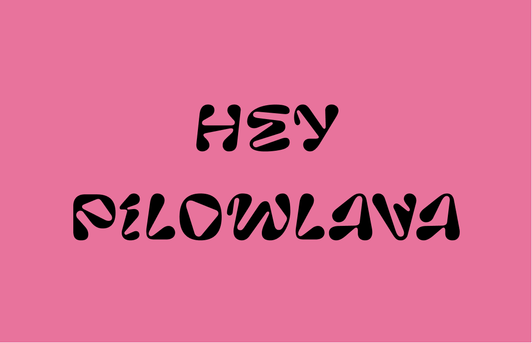
- Font: Pilowlava, crazy display font with vibrating intensity. Are you creating gif or visual? This is for you!
- Design/Marketing Idea: Text as Image
- Color Inspiration: Sunrise in Joshua Tree, California

img: sample of Pilowlava, paired with Space Grotesk
Font of the Week
Do You Know Pillow Lava?
There is something crazy about Pilowlava. It is one of the most decorative, creative fonts I have seen in a while. Not your typical serif or sans serif, Pilowlava is a lot more extra than a regular old display font. The source of inspiration for Pilowlava is the reason for its stimulating shapes. Pillow lavas are Pillow-shaped lavas formed from the extrusion of lava underwater. Hence, the font is appropriately named, with voluptuous ebbs and flow on the letters. Our eyes are naturally drawn from one letter to the next on this font.

img: actual Pillow Lava; source: wikipedia
Font Details
- Contorted strokes mimic the shape of lava
- Only has Uppercase
- There is a 3D version of this font, which can be rendered and used in 3D software (like Blender)

img: font detail of Pilowlava

img: Pilowlava in 3D, source: velvetyne.fr
General Usage Tips
- Not suitable for body text (too decorative)
- One weight, one style only
- Pairing: with sans serif, like Space Grotesk and Nunito

img: Pilowlave pairs nicely with Space Grotesk
Specific Usage Tips
How can I use it for logo?
- Watch out for legibility
- Reserved for specific brands
- Communicates young, trendy, hip, edgy, transformative(speed)
It’s difficult to use Pilowlava as a logo font, primarily because it has limited legibility. Regardless, it has been used in logos. It’s a trendy, decorative font with a lot of character for a creative brand targeting demographics on the younger side.

img: Pilowlava used as branding for xgender, an inclusive community; source: FontsinUse
How can I use it for branding and marketing?
- This font is excellent for social media. post, animations, videos
- The way it looks already makes you think of movements and animations

img: Pilowlava being used as branding for a gallery; source: FontsinUse
Want more Pilowlava? See it in action in this video about the Difference between Whiskey, Scotch, and Bourbon.
Design/Marketing Idea: Text as image
There is a long battle between text and image. Is it the text that pulls on our heartstrings, or is it the picture that’s worth a thousand words? Maybe there is a happy marriage between both in the text as image approach, where the text communicates about the subject visually, in addition to through its meaning. This technique has had a long history in art, design, and publishing. An example is the concrete poetry movement in the 1910s.

Img: George Herbert’s “Easter Wings” (1633), printed sideways on facing pages so that the lines would call to mind angels flying with outstretched wings; source: wikipedia
For branding, sometimes we see a similar visual trickery at play for logos. The classic FedEx logo uses this technique in a more clever, conceptual way: it uses the whitespace created by the letters to create a hidden, additional iconography.

img: FedEx (US shipping company) logo with a hidden arrow. did you spot it?; source: fifteendesign
What would happen if you try this in your marketing visuals?
Color Inspiration of the Week
Every week we feature beautiful photos from our subscribers and community. This week we have a lovely sunrise from Joshua Tree in California, USA. JR is a wireless networking engineer, creator, and maker based in California. Thank you, JR, for this beautiful photo!

Img: Joshua Tree National Park, California, USA. source: JR
Interested in contributing an image? email me your image for a chance to be featured!
Creative Prompt
Can you create a visual for Twitter or Instagram using Pilowlava, Text as Image technique, or the color palette we featured today?
Thank you
…for reading and hanging out here this week! Pilowlava is available here.

img: Pilowlava infographic
If you enjoy this series, you can subscribe here:
Have more questions about design and fonts?
Please email me [email protected] or find me on Twitter at @HuaTweets.
You can also read the past issues on Typogram's blog.
