If users need a walkthrough, the UI has already failed.
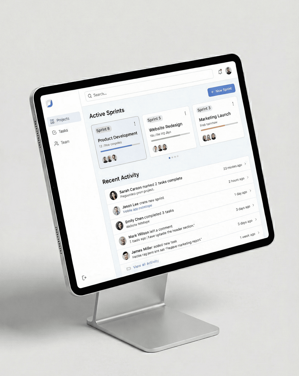
One thing I’ve learned while building internal tools is that explanations are usually a design smell.
Good UI answers instantly:
What just happened
What can I do next
What will happen if I click
If those answers require onboarding, friction creeps in.
Lately, I’ve been prioritizing:
Clear visual hierarchy
Strong defaults
Predictable feedback
Fewer decisions per screen
This has significantly reduced confusion and support questions, especially with complex tools.
We think about UI this way while building systems at Qwegle, where interfaces need to support real work, not exploration.
https://qwegle.com
https://qwegletechie.github.io/qwegle.github.io
If you’re redesigning a complex UI and want an outside perspective, we keep a simple contact page open for discussions:
👉 https://www.qwegle.com/contact

