I'm redesigning my Marketplace. Do you have any feedback?
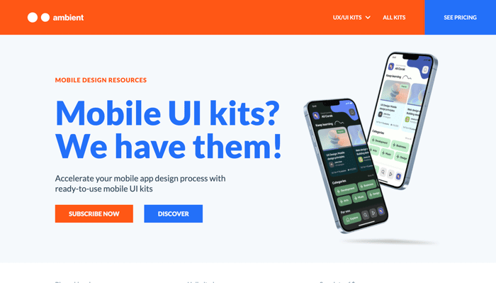
I created a marketplace where I design and deliver mobile app UI Kits. I have no doubt that the mobile UI kits are of high quality. But I couldn't reach the audience and I need to increase my sales. We launched, but we made a mistake, we didn't care about the landing page. It's clear.
For example, we offer subscriptions, but we could not explain this clearly on the landing. That's why I decided to redesign Ambient Design's marketplace.
I don't collect products from different designers like ui8.net. I designed all the UI kits on the Marketplace.
Also, if you know of a site suitable for my business model or if you have feedback, please let me know.
Here is my site: https://ambient.design/

To be blunt, the design did not feel like it was Senior UI Designer quality. I mean it’s not that bad—it looks better than bootstrap after all. But, I still feel like there’s room for improvement.
If I’m buying an UI Kit, I want to be sure that blood, sweat, and tears were spilled over every single little pixel. I’m paying for the UI Kit because I don’t want to have to spend my own time doing that.
If the UI Kit is not high quality or does not cover enough use cases, it will cost me more time than it saves.
---
Like what?
First, colors. Way too many attention grabbing colors. You want me to focus on the blue right? Or the orange? The pricing in the navbar or the subscribe now button? Part of directing your user to a CTA or action is ensuring that the happy path is clearly visible and that secondary actions are, well, secondary.
The “Bi-weekly releases”, “Unlimited access”, etc. should be bold and should not have hover effects.
Don’t resize icons. The icons above the sections with “Bi-weekly updates” feel like they are blown up. Material UI icons also have an “Optical size” option you can use up to 48px. You can also try other design alternatives.
Scrolling down the page, again, it’s a very distracting bright cyan background, which hurts bad eyes. The $34 feels out of place next to the buy now button. Look at Amazon or Target.
The “Subscription” in a bright teal background looks like a button, but doesn’t do anything. The bullet point alignment under “Unlimited access to all ambient stuff with a single membership” feels off. I can’t tell if the CTA is blue or orange. You should always have a clear primary action with a subtler secondary action.
Your newsletter doesn’t tell me how often you will be sending emails or that you won’t share my information.
I could go on, but I do that enough for my day job haha
---
Anyway, your home page does not inspire confidence in your templates.
I give this feedback not to tear you down, but to give you insights where you can improve and build yourself up. I hope you find it constructive.
I look forward to seeing you grow as a designer and making more beautiful templates and landing pages in future!
---
You might enjoy some UI resources.
Hi 👋
Your comments and the time you spend reviewing the site are invaluable. I also read your comment carefully. First of all, thank you for this honest and transparent feedback 🙏
I also realized the mistakes you mentioned. Frankly, I didn't design the landing. My friend who designed the landing is also talented, and I think he is good in his field. As I said, it was necessary to design a website quickly in order not to delay the launch. Unfortunately, the design is not good enough. We designed and coded in 2 days; we made a mistake 😄
I was very happy to hear about the mistakes from someone else, I realized that I was on the right track. BTW the resources you shared are great, especially the Shift Nudge is dope! On this occasion, let me share a resource that I think you will like; https://designfulltime.com/
Again, thanks for your honest feedback mate ✌️
The goal for UI templates is for you to spend a lot of time on the template, so that I can design a website quickly 😂 not for you to make a template quickly so that I have to spend a lot of time polishing it and making it work for me
The landing page is a reflection of your UI templates. If you didn’t get all the details right here, I’m betting you didn’t take care of the details in your UI templates either. Unfortunately, I have many critiques for your templates too.
Hope it helps!
Design very nice :)
Thank you Uğur 🙌 But we didn't get the sales we wanted. So, I will redesign it 😀
Congratulations Ali, I think it's a very good idea and a great project. I'm sure it will be an excellent convenience for those who have such needs.