Looking for (more) feedback for job board for junior developers - Update #1 💻
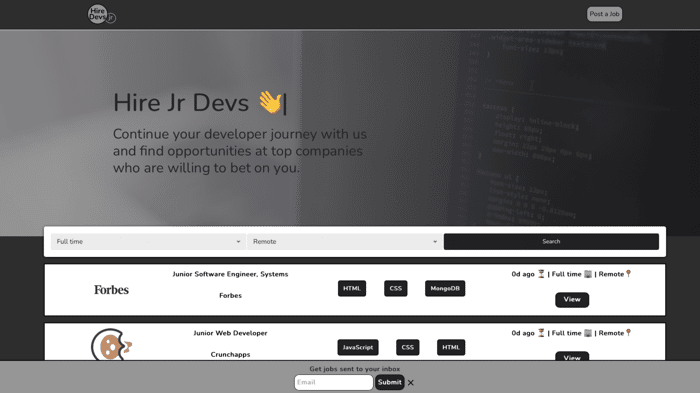
I posted on Indie Hackers 9 days ago looking for feedback for my recently launched job board for junior developers called HireJrDevs, and I got a very good response, so I wanted to give everyone an update on what I have achieved this week and how I have applied the feedback given.
Showing you what I have done last week reminds me of this
In summary, the first post helped me gather a ton of great feedback from many people and developers out there. I also made some internet friends which gave me excellent advice and inspired me to keep moving forward with my job board with even more confidence than before.
If you want to check out the first post and see a picture of how the job board looked like, you can click here
If you want to know how the job board looks like right now, go here:
https://www.hirejrdevs.com
Feedback Received Summary
-
Get rid of modals for job details. Bad for SEO.
(I did this. Now I show the details about each job on a different page)✅ -
Get rid of error message from TinyMCE Editor ✅
-
Raise pricing ✅
(It was $30 to post a job for a month. Now it's $149, still cheap compared to other job boards) -
Fix Font ❌
(I haven't fixed the font just because I kind of like the font that I'm using, but I'm currently trying other fonts. I haven't decided on this yet.) -
Change Color Palette ✅
(Changed yellow and green for dark colors. I like the current palette, but this is still an open item on my list. I'd like to explore a few other colors and/or improve the current one)
Things I'm working on / New Features & Improvements
-
Added new logo to the website✅
-
Added company logos/images for job cards and job details pages ✅
-
Added option to reach me by email ✅
-
Added a ton of CSS to make website more responsive ✅
-
Added more emojis (Ok, this shouldn't count lol) ✅
-
Getting clients/people to post jobs 🔧
(Had some very promising conversations last week. Making good progress) -
Getting developers to sign up 🔧
(There are 100+ developers signed up already. Feel free to sign up if you haven't) -
Working on SEO by adding subcategories of jobs as suggested on part 1 (need to get more jobs posted though) + other SEO strategies 🔧
-
Implement upload option in the post job form 🔧
-
Implement feature to pin premium jobs at the top and highlight their job cards. 🔧
-
Redo the entire search functionality + search bar 🔧
(I don't like it) -
Generate a better URL for job details pages (SEO friendly) 🔧
-
Add Login & Authentication 🔧
-
Add a control panel for recruiters to be able to edit jobs 🔧
These are some of the things I have on my list.
Feel free to let me know if you have any ideas, suggestions, what works, what doesn't, what you like, what you don't like, anything helps :)
Thanks everyone 🙏
This community is the best.
You can find me on Twitter as well.
https://twitter.com/balt1794

Great idea, now the critique:
Thanks for the feedback !