1
7 Comments

Roast my competitor comparison page
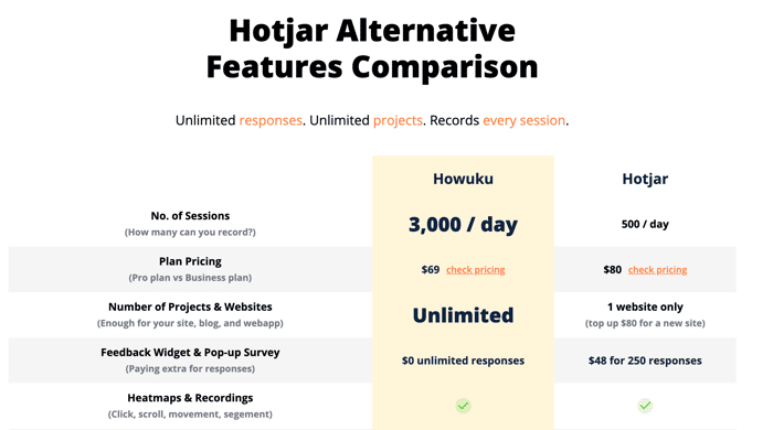
https://howuku.com/comparison/hotjar-alternative

I am just working on improving my competitor comparison page and want to hear your feedback on what you think about it.

Too wordy? Too detailed? Not informative?

Thanks in advance!

submitted this linkon October 3, 2022
  1. 2
    1. The subline in the hero is to wordy
    2. Don't center the text in the first column of the comparison table
    3. Why is the table hidden on mobile?
    4. I would reduce the overall number of words dramatically - the more you write, the more you "hide" the most important message.
    1. 1

      Thanks for the feedback! Totally agree with all of the above, I’ve reduce the number of words dramatically 😁 and made the information easier to absorb.

  2. 2

    Hey Donald,

    A couple of suggestions from someone who is both a current product marketer and former designer:

    1. I'd move the grid comparison up on the page, potentially right under the main header. The grid and the "why pay more for less" sections are a bit repetitive. Maybe there is a way to merge that content together in the grid. I'd also pull up "Unlimited responses. Unlimited projects. Records every session." with this—I like this headline as a summary.
    2. I'd layer in the customer quote from someone who chose or flipped from Hotjar to drive home credibility and highlight your differentiated value.
    3. From a design standpoint, I'd recommend making all the text within Howuku and Hotjar columns the same font size and weight to improve legibility.

    Of course, you could always ship it then your software to optimize  😉

    1. 1

      Thanks for the feedback!! It is really insightful, especially for the 3rd point, to increase legibility just like that.

  3. 1

    Howuku is a better alternative to Hotjar that is simply much more powerful and affordable for your marketing & product team.

    The headline is not precise enough. Powerful can mean everything, and for the "affordable" I'd give specific numbers (ex: 32%) in this case to add more impact to your message.

    Number of Team Members

    Since it's not an advantage I wouldn't really put it there

  4. 1

    Hi Donald,

    Your design really needs some white space between each section.
    Users need time to think before moving to the next section.

    Cheers

    1. 1

      Thanks for the feedback much appreciated!

      Anyway, I will probably do A/B testing on our designs to see if it actually increases our conversion rate, as a fun experiment!