Roast my re-designed website?
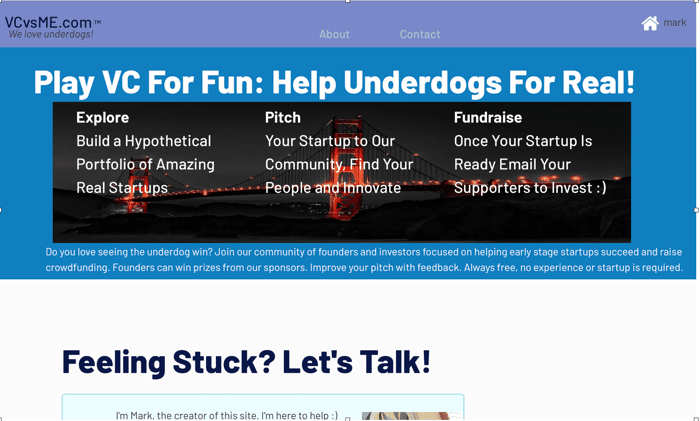
Okay so a couple days ago I asked how credible my website looked VCvsME.com over here:
https://www.indiehackers.com/post/how-credible-does-my-site-look-2d728fb50a
I got roasted. So I redesigned the app, it's a lot cleaner looking now - but also less detailed and less information on it. Thoughts / reactions to the redesigned version - versus the new version? A screenshot of the old version is in the picture above.

Looks like a 2010 facebook wanna be. But definitely looks "better" than the previous version, design wise.
I am more concerned about the product.
Thanks for the response. The software product its like Linkedin for entrepreneurs, but an MVP. You can follow people, also comment on pitch decks, and create a "paper portfolio".
In terms of your overall comments & concerns - I get it. It's a new product. There should be doubts. The main differentiator service is editorial review of pitch decks. Rather than some fancy new software feature - human interaction and advice.
Design wise I think it's fine enough for me, in that I would sign up if I understood what it was going to help me with and it applied to me. The previous one you screenshotted was a little off putting. Any kind of social proof would be amazing to lend itself some additional credibility at some later stage if you can get it.
I think the main thing is that I'm not really sure what problem it's solving. I get that it's social networking for fundraising with a slight gamification aspect. The about page has more details about the value proposition. I would try to succinctly highlight the benefits and pain points your targeting directly on the landing page.
It's probably fine bumping the login box down and putting a simple CTA button to register (and a small login link at top) and using the real estate to explain what's going on.
Slightly tricky is that you have two paths in this dual sided market, investors and founders and they have different concerns. It might make sense to put them side by side e.g. "For Founders" and "For Investors" just to avoid intermixing and alienating one group. For the investor side, the FOMO of missing out on deals is a very strong motivator if the deals are unique or "first seen" on your platform. And for the founder the ability to pitch and feel out ideas in a live environment with investors waiting for updates seems like it would help me understand idea traction earlier, which will help me navigate ideas quicker and ensure the ideas I do land on have a better chance of getting funded if I got positive signals from the platform. This helps me reduce the long drawn out pain of uncertainty.
Just my thoughts, good luck!
Great, thanks for commenting! Yeah in terms of 2 sided markets they're tricky and I've failed miserably before when the sides were totally different requiring a multi-pronged marketing approach - these 2 sides are actually pretty close. Lots of entrepreneurs are investors and vice versa.
The "killer" feature is rapid feedback if you are an investible startup - or not - steps to potentially get there. And once you're there, help getting investors - since we're both on the same page - awesome startup, investible, just need to make a deal win-win. Of course, nothing wrong with bootstrapping, and only a small % of companies raise outside funding.
It is nice and clean at the moment! I don think a photo or maybe a screenshot would pick it up. Also you first alinea could be larger and bold. I would maybe put the second phrase on top of it (in smaller font)
there is a whole science on landing pages and perhaps you could look into templates for it. I use cardd, eg: https://searchbox.carrd.co
Not sure about the idea.
Regarding landing page itself, it looks like Facebook login page. Would be better to have some feedbacks, features etc instead of plain login page.
Thanks for the reply and feedback. Yeah I can definitely see where you're coming from! lol.
The idea is a bit of a work in progress. Feel free to roast the idea, too :)