Visitmotion Has a Fresh Look
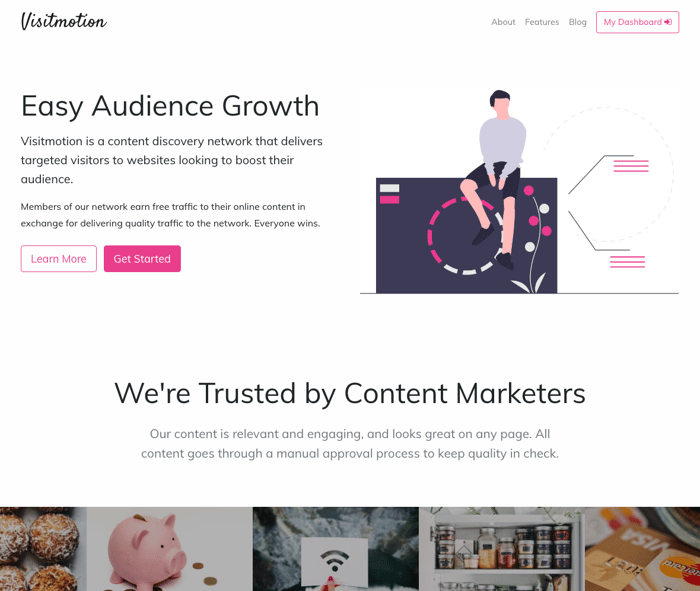
A little over a week ago, I asked the Indie Hackers community for feedback on the landing page for Visitmotion.com.
I had some really helpful responses, and so I set to work making some changes to the landing page. I perhaps got a little carried away, since I ended up changing much of the UI, including the user dashboards 🤷♂️
Highlights:
- A tighter theme
- Inclusion of actual publisher content on the homepage
- A stronger focus on CTAs
- Updated copy
- New user dashboards:

I decided to go with the popular Undraw for illustrations (despite, in my opinion, being slightly over-utilised in the community) until I have more time to decide on an alternative.
Overall I'm happy with the new look — I feel it's cleaner and more concise, which helps convey the product a little more efficiently.
As always, feedback is welcome! Thanks for reading 🙂

I signed up and submitted one of my content sites :D
I learn something everyday :)
That's great, thanks! If you have any feedback or suggestions, I'd love to hear them!