We turned our personal finance app from a “tool collection” into a decision engine
Hey everyone,
over the last weeks we did something that felt small at first but ended up being a full product rethink.
We didn’t just redesign our UI.
We changed what the product actually is.
The problem
We’re building a personal finance app focused on relocation and international comparisons.
We had:
tax calculators
cost-of-living comparisons
budget tools
investment simulations
Each tool worked well on its own.
But together?
It felt like a collection of features, not a product.
Users got answers like:
your net income is X
rent is Y
country A is cheaper than B
But the real question remained unanswered:
👉 “So… what should I actually do?”
The key insight
Personal finance is not a data problem.
It’s a decision problem.
Users don’t want:
more charts
more breakdowns
They want:
👉 clarity on the next step
What we changed
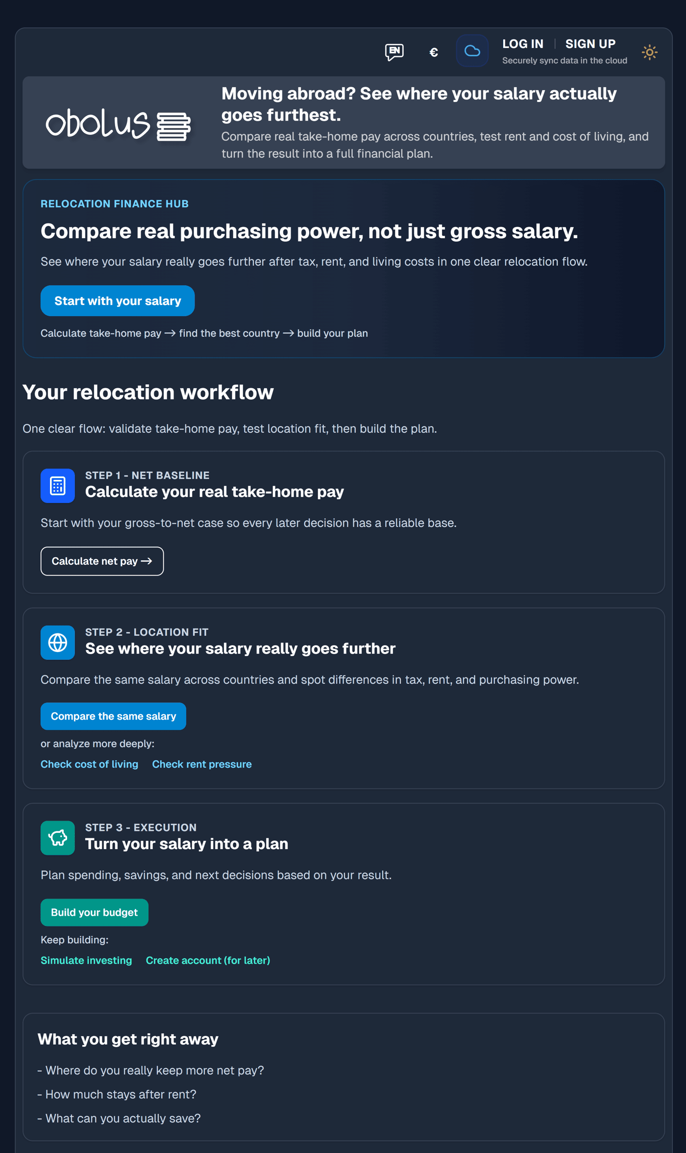
We rebuilt the entire app as a linear decision flow:
Net income
Cost of living
Rent pressure
Tax comparison
Budget
System (cockpit)
Investing
Each step answers exactly one question.
The biggest UX change
We introduced a Decision Engine layer on every page.
Above the fold now always shows:
current scenario (state)
a short interpretation
one recommended next step
No more:
“Here are 5 things you could do”
Only:
👉 “This is what you should do next”
Example
Instead of showing multiple rankings:
We now show:
“Australia gives you +749€/month vs Germany”
And then:
👉 “Next step: check housing pressure”
What we removed
This was the hardest part:
~70% of above-the-fold content
multiple CTAs
“explore” sections
dense KPI blocks
We intentionally reduced optionality.
What changed as a result
The product now feels:
more focused
easier to navigate
more like a system than a website
Internally, we describe it as:
👉 “from dashboard → decision engine”
What we’re working on next
We’re currently adding:
dynamic decision logic (next step depends on your data)
smarter recommendations (e.g. high rent → skip to budget)
tighter scenario persistence across steps
Would love feedback:
Does this direction resonate?
Have you tried similar shifts from “tools” to “flows”?

