Why I moved Portfolio Value to the background and put a Health Score in the spotlight
I recently realized that for my users, seeing a large bank balance is not enough to stop the Retirement Anxiety. A number like $1.2M is static and does not account for 2026 market volatility.
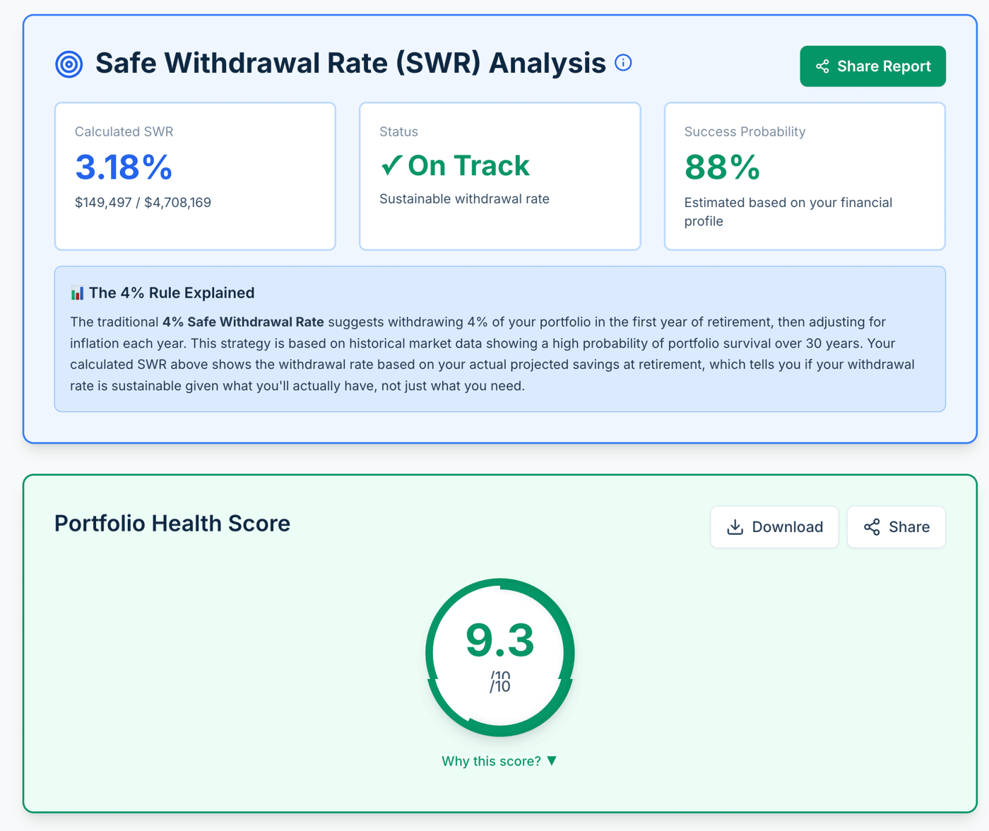
I just shipped a major UI pivot for WealthLogic:
The Hero Section: I added a Portfolio Health Score (1-10) as the most prominent section. It is a weighted grade based on SWR safety, Monte Carlo resilience, and income-to-expense ratios.
The Data Section: I moved the raw Portfolio Value and asset breakdown to a secondary section.
The Why: Users now get an immediate diagnosis (e.g., 8.4/10 - On Track) before they even look at their balance.
By leading with the score instead of the sum, the app now provides a Financial Audit rather than just a Net Worth Tracker.
Technical Note: I am optimizing the shareable mobile reports now. 75% of my users are on mobile, and I want them to be able to share their 9/10 health status directly to FIRE communities.
Fellow builders: How are you balancing data density vs actionable insights in your dashboards?
[Link to WealthLogic.io]

