Would YOU convert? ;)
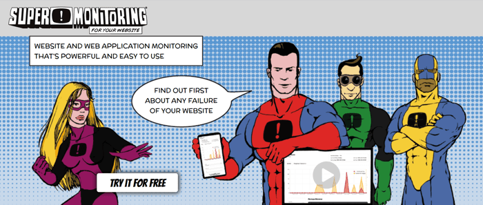
For another try with CPC ads I created a landing page that is a slight modification of the website's home page.
The CPC guy says I should repeat the form just below the hero image - but I'm afraid no one would then scroll down below it.
Is it really good that the navigation (the main menu) is hidden?
Or perhaps it should be displayed but used only for local navigation within the page (anchor links)?
What do you think? Would you convert? ;)

I wouldn't. Way too hard to read for me to have spent the time reading 'what we do for you'. All the top stuff is just marketing guff.
I watched the video for 15 seconds and I totally got it.
It's not for me, but I would consider it as an option because you stand out :)
need some testimonials now :)
My 2 cents. I too find that there is too much info on the landing page. It seems that most of that info should be on the "all features" page or something.
As a developer, it's actually very useful to have all the features listed. But a business owner probably does not understand most of the technical things there.
I would press on some pain points. I tried to come up with some, but it's actually pretty hard.
Maybe have a diffrent landingpage for diffrent audience?
Superhero/Marvel vibes are not for me so I can't connect much with the concept. I get the idea, but not to my taste.
I left some ideas on how to improve the page - https://visualdebug.com/show/supermonitoring.com
Thanks.
I can't see the option to answer in Visual Debug, so I will respond here:
Remove it from this page section.
Why would I remove CTA?
That's not the logo of Capterra. Add the real one, if they are you customer.
It's not a logo, but their badge with official rating.
Make the video more visible
Any idea on how to do it?
The video point is good. I only saw that video after opened the LP a second time. Missed it on first.
Okay, why don't you just create a new element emphasising on the high G2 rating you have? Maybe even put some customer review as well.
Not me. Kept feeling annoyed I wasn't at the form yet as I scrolled.
The absolute top benefits they get from using all those features.
It's kinda risky to put headline and summary text in an image too (and those need some benefits too). And the try for free button in the header image prob would do better in the top right hand corner. It's hard to see where it is.
Maybe look at the language too (which hints at the perspective you're seeing it from). Move from 'what WE do for YOU' to 'what YOU get'. You're not conferring some kind of honor on them. They're going to compare your service elsewhere. Focus on what the customer wants. Like, you buy a product or service because it benefits you in a specific way. Probably quite a narrow margin of benefit. Then you're super happy when you realise it comes with a bunch of extra stuff.
I wouldn't.
2 - It's not fake. We've been on the market since 2008 (since 2010 as Super Monitoring). We have more large customers (including government) in our portfolio, but the other large companies are local (Polish), not recognizable globally.
3 - From that (and some other) comments I'm starting to think that creating a simplified dedicated landing page doesn't make much sense as it should include all the info from the main website...
I actually managed to go to your real homepage and it seems A LOT more legit. The simple page seems like a scam/email magnet page, not for an actual product.