"Looks Good to Me" Is Quietly Killing Your Feedback Loop
"Looks Good to Me" Is Quietly Killing Your Feedback Loop
When you're building a product, the feedback you get on your website and app is only as good as the medium it arrives in. And for most small teams, that medium is a mess: a Slack message here, a screenshot there, a "looks good to me" that turns out to mean "I didn't actually look closely."
I want to make a case that the format of your feedback loop matters more than the volume of feedback - and that fixing the format is one of the highest-leverage, least-glamorous things a founder can do.
The founder's feedback tax
Early on, you are the router. Feedback comes in from customers, teammates, and your own eyeballs, and you translate all of it into tasks. Every vague report is a decision you have to make: what did they mean, is it real, where exactly is it, is it worth a fix? That routing work scales badly. As the surface area of your product grows, "translate fuzzy feedback into clear tasks" becomes a part-time job you never hired for.
Why vague feedback is a format problem, not a people problem
It's tempting to blame reviewers for lazy reports. But a website is visual and interactive, and the tools we hand people - chat, email, docs - are text-first. We're asking people to describe a picture in words and then acting surprised when the description is lossy.
Change the format and the behavior changes with it. When a reviewer can click the exact element and pin a comment to it - with the browser, screen size, and page URL captured automatically - the "looks good to me" problem largely disappears, because pointing is easier than describing. I dug into the mechanics of this shift here: why visual feedback beats vague reports.
What I'd optimize if I were starting again
Make reporting the easy path. If leaving precise feedback takes more effort than firing off "looks broken," you'll always get "looks broken." Lower the friction on the good behavior.
Capture context automatically. Never rely on a human to remember to note their browser and viewport. Machines are good at that; people aren't.
Keep feedback attached to the thing. A comment pinned to a page element survives; a comment in a channel scrolls away by lunchtime.
The build-in-public angle
If you share your work publicly, the format matters even more. Public feedback is a firehose, and un-anchored comments are nearly impossible to act on at volume. Anchored, context-rich feedback lets you triage a flood into a queue - the difference between drowning and shipping.
The takeaway
You probably don't have a feedback shortage. You have a feedback-format problem. Fix the format - make it visual, anchored, and context-rich - and the same people give you dramatically more useful input for less effort on both sides. For a solo founder or a tiny team, that's not a nice-to-have. It's hours back in your week.
Vynix is a visual website feedback tool, so I'm biased - but the full argument for visual feedback stands on its own.

Screenshots with an actual arrow on them solve most of this for me. Vague feedback usually happens because the reviewer would need several sentences to describe where they're looking, so they just don't bother. SlimSnap.ai, my screenshot tool, has annotation built in for exactly this, box the problem, add a short note, send it.
slimsnap.ai
The part that resonates most: "looks good to me" is a format failure, not a laziness failure. The same pattern shows up in code review. "LGTM" isn't laziness; it's what happens when the review surface doesn't make the specific concern easy to point at. Lower the cost of precision (click the thing vs. describe the thing), and people will default to precision. Worth remembering: any time you're designing a feedback surface, the same logic applies to agent outputs and docs, not just websites.
the “keep feedback attached to the thing” part breaks once the thing gets regenerated by an agent.
ran this in PreApp this week: a reviewer selected one sentence in an HTML report, the note kept the selected text + source version, and the agent shipped v2 on the same link about 3 mins later. without the source version, the pin would've looked precise but pointed at a moving target.
i'd keep the reviewed snapshot as part of the feedback record, not just browser + viewport. otherwise a perfect element selector can still be wrong after the next publish.
Anchoring feedback to the interface solves spatial context, but there’s also temporal context. A month later, the page has changed and the team may no longer remember what was being tested, what the reviewer expected, or which decision followed.
The most useful feedback record would preserve the observation, product state, expectation, and resulting decision together. Then feedback becomes reusable organizational memory rather than disposable task input.
Have you explored preserving that history when the referenced element changes or disappears?
That "looks good to me" feedback loop is a silent killer for product iteration. Relying on vague text descriptions instead of anchored, visual context creates endless friction for solo founders. Excellent breakdown on fixing the feedback format.
So true. Vague feedback forces you to guess, and you end up building the wrong thing.
This matches what I've seen. The worst part of vague feedback isn't the time it takes, it's that you guess what someone meant and end up building the wrong thing from an honest report. What helped me was capturing the context in the moment. A screenshot with the page and what they expected beats a message written from memory later, when half the detail is already gone. The tricky part is asking for that without making it feel like filing a bug ticket. Have you found a way to get the structure without scaring off the casual feedback?
Have you tried using instant video clips or annotations? That usually bridges the gap without feeling like a formal bug report.
This hits a pattern I ran into getting feedback on my product. The real split: polite praise vs acute pain signals. "Looks good" is noise. "I tried to do X and it broke" is gold. Filtering for painful signals turned every conversation from validation theater into actual product direction.
I have seen the same thing with PR templates. The PR templates had long checklists to make reviews easier, but over time people(including me) got tired of filling them. And the answers became less useful.
What helped was automating most of the context from Jira, Confluence, etc. Then developers only have to add the parts that really needed explanation. Reviews and the feedbacks got better because the format became easier. Because the format changed, not people changed.
"you have a feedback-format problem" really stuck with me. the "what did you expect when you clicked that" question is gold, but i think you're right that changing the medium does more than changing the question. text just quietly nudges people toward "looks good" because writing out a visual problem is annoying. how do you get people to actually leave the anchored feedback though? in my experience the hardest part is just getting them to bother at all.
Completely agree. The fewer follow-up questions needed after a bug report, the faster you can actually ship fixes.
Machine Arena team here. One layer nobody has named yet: "looks good to me" is unfalsifiable, and that is the deeper reason it carries zero information. An approval can never be wrong, so it costs nothing to give. What changed behavior in our world was not a better capture format, it was making the judgment gradeable after the fact. We run a platform where spectators judge live AI matches, and nobody writes reviews there; they call an outcome, the match finishes, and reality grades the call in front of everyone. The moment a judgment can be scored, people start actually looking, because being visibly wrong stings more than being vaguely agreeable.
The product feedback translation: instead of asking a reviewer to approve, ask them to predict something checkable. "A first time visitor will find pricing within one scroll" can be graded by your next five usability sessions. "Looks good" cannot be graded by anything. This pairs well with your anchored context point, since a prediction is only auditable later if the state the reviewer saw is captured alongside it. And it stacks with Gregory's ownership point: format lowers the cost of precise feedback, ownership attaches a name to it, and a gradeable prediction is what makes the lazy version impossible to hide.
One note of caution - "LGTM" is (in my mind at least) associated with PR reviews, and I think your tool is more general than that. So I'd probably stay away from that phrase.
Note of optimism - if you can pair this with something like Firebase's automatic preview deployments, you might have a nice starting niche.
The point about precise reporting being easier than vague reporting is dead on. One thing I'd add is a 15-second capture path: click the element, speak the issue, and attach the browser and page context automatically. I built DictaFlow around cutting thought-to-text friction, and feedback is exactly the kind of moment where typing a careful report feels like too much work, so people default to "looks broken." Voice shouldn't replace the pinned context, but it could make the useful path a lot faster.
The format problem framing is right and I think it generalizes past visual feedback too. I see the same failure with AI generated code review, someone writes looks fine on a diff because describing exactly which line and which assumption is wrong takes real effort, so the path of least resistance is a vague approval. Pinning feedback to a specific element, whether that is a pixel or a line of code, is what turns a report into something actionable instead of something the founder has to translate through several more questions. Curious how much of Vynix's structure you borrowed from code review tools versus building it fresh for visual bugs.
The routing work is the hidden tax. I'd add a step earlier though: why do people give vague feedback in the first place? It's not laziness usually, it's that they don't have a mental model of what they're supposed to be looking for.
"Looks good to me" often means "I don't know what metrics matter here" or "I can't trace the problem back to its source." They're viewing the product as users, not as builders, so vague feedback isn't a format problem initially - it's a context problem.
For build-in-public specifically, this gets inverted. You have volume, but your audience has less context than your teammates. Anchoring feedback becomes even harder because you're explaining not just "where is the problem" but "here's why this matters to the direction."
The payoff is worth it though - people who understand the direction give better feedback even in text. The format fix (screenshots, video, etc) is a multiplier, not the foundation.
For a solo maker the problem is one step earlier. I don't get vague feedback, I get silence. And silence has the same shape as "looks good to me": zero information, and you can't tell if it means fine or nobody cared.
I launched something this morning. Most reactions were nothing at all. The one comment that actually moved me was from a guy who said the follow-up reminders "came on the day I needed them, which never happens with my own reminders". That single sentence told me which part of the product is the real value, and I would never have guessed it from a hundred generic upvotes.
So your point about pointing being easier than describing works for me in reverse too. When you ask, ask about a specific moment, not the whole thing. "What did you expect to happen when you clicked that?" gets a real answer. "What do you think?" gets nothing.
The format point is real, but there's an incentive layer under it: 'looks good to me' usually means the reviewer has no skin in what ships. What fixed it on my teams was assigning one named owner per review who had to either file a specific issue or sign their name to the approval, and the vague sign-offs disappeared overnight. Format lowers the cost of good feedback, ownership raises the cost of lazy feedback, and you want both.
This hits so close to home. So many teams mistakenly chase more feedback, yet ignore how broken the feedback collection format is. “Looks good to me” isn’t laziness—it’s a natural outcome when people lack a simple way to leave precise, anchored notes. Visual feedback removes the burden of translating visuals into text, cuts down the founder’s constant “feedback translation tax,” and turns messy scattered messages into actionable tasks. Couldn’t agree more that fixing feedback format is one of the most underrated high-leverage optimizations for small teams and solo founders.
That's nice
Anchoring feedback to an element solves "where", but not "why it matters". The useful minimum is: expected behaviour, observed behaviour, and impact, with the browser and screen size captured automatically. Without expected versus observed, a precise pin can still amount to "this looks wrong". I would also separate defects from preferences when feedback is submitted, because they need to be sorted differently. Which of those details do reviewers provide reliably without making feedback feel like work?
"I'm a young entrepreneur with a validated marketplace idea connecting local businesses with freelance helpers. Businesses post tasks, helpers apply and get paid directly. I have the market research and local connections, but I need a developer co-founder to build the app. Looking for a developer!"
Really enjoyed this perspective. I think the biggest hidden cost isn't getting feedback—it's interpreting it.
I've seen teams spend more time asking follow-up questions ("Which page?", "Which button?", "What device were you using?") than actually fixing the issue. By the time you've gathered all the missing context, the bug might have taken only a few minutes to resolve.
That's why I think visual, in-context feedback is such a game changer. When comments are attached directly to the UI and technical details like the URL, browser, and viewport are captured automatically, the conversation shifts from "What do you mean?" to "Let's fix it."
For small teams and solo founders, reducing that feedback back-and-forth can have a surprisingly big impact on shipping speed.
this tracks. “looks good to me” is usually “i didn’t want to write a paragraph”
the format point is the sharp one. if reporting precise feedback is harder than being vague, you train people to be vague
automatic context capture is the part most teams skip and then waste hours recreating. browser, url, element, viewport should be free
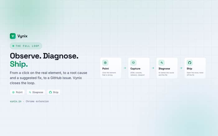
curious for solo founders using vynix: does the diagnose → github step actually save more time than just the point-and-comment part?
The format-not-shortage framing really clicks for me. I hit the same thing in a totally different corner, youtube analytics. Creators aren't short on data, Studio throws a hundred numbers at them. But the format is a wall of metrics with no 'so what', so people glance at it and do nothing. Same disease, different screen.
Funny enough your fix maps over too. What makes feedback usable for you (anchored, context-rich, not 'looks fine') is basically what makes a metric usable: tie it to the exact thing it came from and say what to do, or it's just noise people scroll past.
I ended up building a small thing for the analytics side of this (algolens), so same bias disclaimer as you. Point holds without it though. Genuinely curious how it plays out on your end: do people still leave lazy comments even when the format makes the good path easy? Or does making it easy actually change what they do?
Everything in this maps to client work too. When I freelanced on the side, the reply that scared me most wasn't criticism, it was a client sending looks good after a two minute skim. That approval means nothing. Three weeks later at handoff they finally look properly and you're doing rework that was avoidable in week one.
Your pointing beats describing line is the fix there as well. Once I started walking clients through the thing on a call and making them click around instead of replying to an email thread, the fake approvals mostly went away. Cheap precise feedback early is what makes the final sign off actually mean something.
"LGTM = I didn't actually look" is painfully real. When I shipped my Shopify guide's landing page, I sent it to 5 friends. Got 5 variations of "looks good!" Zero actionable feedback. Then I asked one person to screen-share while they tried to find the download link. Watched them scroll past it twice. That 2-minute screen-share taught me more than all the "looks good" comments combined.
The router problem you described is exactly why I stopped asking "what do you think?" and started asking "show me you trying to do X." It cuts out the translation step entirely. Are you building anything around screen recording or visual annotation to enforce this format change?
The founder's-feedback-tax framing is the part I'd push on. Lowering the friction to report gets you more reports, and anchoring them (element, browser, viewport) makes each one cheaper to triage, but I'm not sure it shrinks the routing work you're describing, it just changes its shape. You still have to decide whether an anchored pin is a real bug, a one-off rendering quirk, or someone's browser extension messing with the DOM. The format fixes the description-is-lossy problem, but the is-this-real judgment call is still a human doing triage, just with better inputs. Curious whether Vynix users report spending less total time on feedback, or the same time with a much higher hit rate per hour, those are different wins worth measuring separately.
That's a great distinction. Our goal isn't to remove human judgment, it's to remove the ambiguity before that judgment happens. Someone still decides whether it's a bug, expected behavior, or an extension conflict. What Vynix tries to do is package enough browser context upfront so that decision takes minutes instead of multiple rounds of "which page?", "which browser?", or "can you reproduce it again?". Time-to-first-action is one metric we're watching closely as more teams adopt it.
The point about keeping feedback attached to the exact thing feels especially important for public launches, where people often say “looks good” or “this is confusing” without pointing to what caused the reaction. Do you see Vynix working mainly with invited reviewers, or are you also building a way to collect precise feedback from anonymous visitors?
Great question. Today it supports both. Teams can invite reviewers, but they can also embed the feedback widget on public sites so visitors can submit precise feedback without needing an account. We wanted the reporting experience to be as frictionless as leaving a comment, while still capturing the technical context developers need.
I think the distinction between a feedback shortage and a feedback-format problem is the most interesting idea in the post.
I'll be curious whether users end up talking about faster bug resolution, better collaboration, or simply less back-and-forth. Whichever benefit they naturally repeat is usually what the product is really selling.
I like that framing. I don't think there's actually a shortage of feedback, there's usually a shortage of actionable feedback. People are happy to say "this feels off" or "looks broken", but developers still have to figure out what that means. If Vynix succeeds, I'd expect users to talk less about AI and more about fewer clarification messages, faster first responses, and less context switching during triage. That's ultimately the outcome we're aiming for.
Appreciate the context.
The shift from collecting feedback to reducing the interpretation burden on developers is the interesting part.
I have a few thoughts on how that changes the value proposition, but I don't think I'd do it justice in a public thread.
If you're open to it, what's the best email to reach you on?