
WrapPixel
Trending Admin Dashboards & Web Templates for Everyone
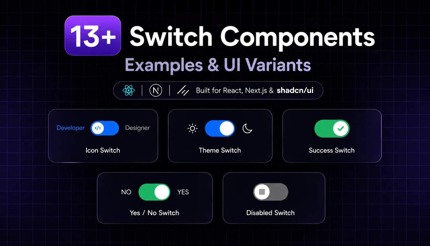
Switch components are a common UI for controlling basic settings such as light-dark mode, privacy preferences, feature flags, and account options. A well-designed switch makes the current state clear and lets users change a setting without extra steps.
Key takeaways
Explore 13+ switch styles with icons, labels, descriptions, colors, themes & different sizes.
Learn how to install and customize Shadcn Switch with CLI, MCP & Manual Code.
Understand the difference between Switch, Checkbox, Toggle & Radio Group.
Use disabled and invalid states to show when a switch cannot be used or needs attention.
All the below Shadcn Switch components give developers a reusable foundation for building small interactions with React and Next.js. With Tailwind CSS, TypeScript, Base UI, and Radix UI, you can customize switch states, sizes, colors, labels, icons, validation states, and layouts to match different application requirements.
Why developers use Shadcn Switch components
Developers can use them for account and profile settings, notification preferences, dark and light mode controls, feature flags, privacy options, admin permissions, form preferences, and SaaS configuration panels. Their clear on/off behavior makes it easy for users to understand the current state and update settings without adding extra interaction steps.
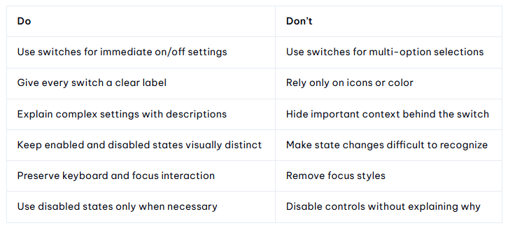
Do’s and Don’ts
The best switch isn’t just visually attractive.
Its state, label, and behavior should make the result obvious to the user.
How to install Shadcn Switch
All the below switch components can be added to a React project using several installation approaches.
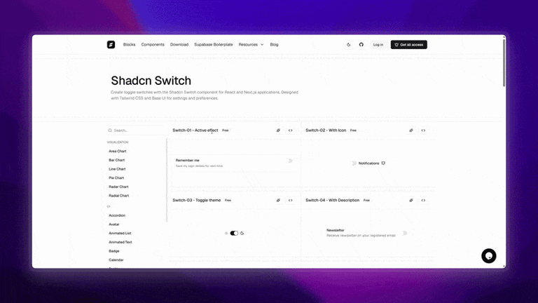
Developers can choose the method that fits their workflow:
CLI installation: Install all the below components using pnpm, npm, Yarn, or Bun.
Code copy and paste: Add the component source directly to the project.
Copy prompt: Use a prompt-based workflow to generate or add the component.
Shadcn MCP: Use the Shadcn MCP workflow to discover and install the Tooltip component through an AI-assisted development workflow.
Here are the best shadcn switch components
This guide covers practical switch patterns for settings, theme controls, feature flags, preference panels, forms, and accessible application interfaces, including custom effects, icon-based switches, theme toggles, choice cards, disabled and invalid states, different sizes, and RTL support.
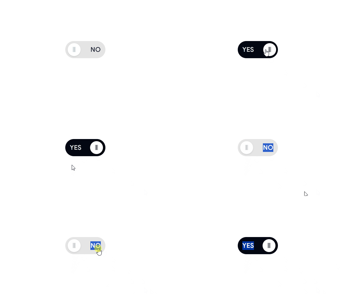
Labeled Switch
A compact switch with visible labels that clearly communicate the current Yes or No state.
Use cases:
Confirmation settings
Form preferences
Feature enablement
Account settings
Best for: forms, settings panels, and binary configuration controls.
Active Effect Switch
Smooth visual feedback when the switch changes state.
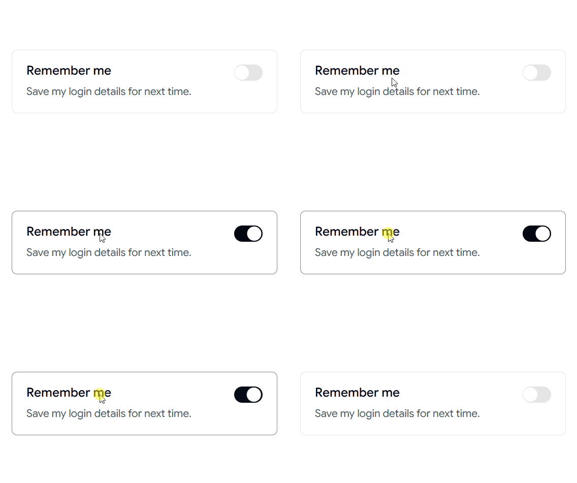
Use cases:
Interactive settings panels
Feature activation controls
Dashboard preferences
Notification settings
Best for: settings pages, interactive dashboards, preference controls.
👉 Read the full Article Here → https://wrappixel.com/blog/shadcn-switch

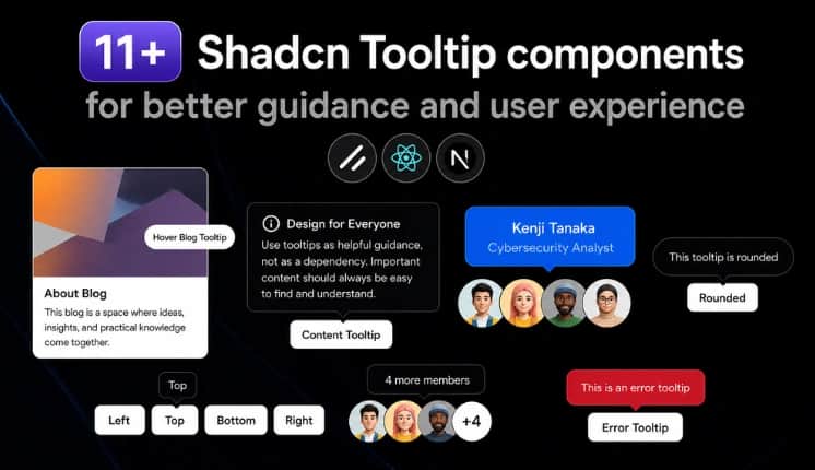
Shadcn Tooltip Examples, Usage, and Best Practices
Tooltips are not designed for every type of message or interaction. They are commonly used for icon buttons, navigation items, keyboard shortcuts, form fields, abbreviations, and other UI elements where users may need a little extra information. Tooltips are a simple way to provide additional context without adding more content to the interface.
Shadcn Tooltip provides a reusable way to add these interactions to React applications while keeping the component easy to customize with Tailwind CSS.
In this guide, you’ll find 11+ practical Shadcn Tooltip examples, different positioning and styling options, accessibility considerations, installation methods, and guidance on when to use a tooltip instead of a popover, dialog, or other UI component.
We’ll also cover advanced examples such as animated tooltips, error tooltips, disabled button tooltips, RTL support, keyboard shortcut tooltips, and lazy-loaded tooltips for interfaces with many tooltip components.
Why use Tooltips in websites & apps?
Tooltips help users understand UI elements without adding permanent text to the interface. They are especially useful when space is limited or when an icon, shortcut, abbreviation, or action needs a short explanation.
Shadcn Tooltips vs Other UI Components
Choosing the right component depends on whether you need brief contextual information, interactive content, or a focused user action.
Use a Tooltip when users only need a quick explanation.
Use a Popover when the content needs interaction or contains more information than a tooltip should display.
Use a Dialog when the user needs to complete a task, confirm an action, or focus on important content.
Use a Toast for temporary feedback such as “Changes saved” or “File copied.”
Use an Alert when the message should remain visible and should not depend on hovering or focusing an element.
How to Install Shadcn Tooltips?
Shadcn Tooltip can be added to a React project using several installation approaches. Developers can choose the method that fits their workflow:
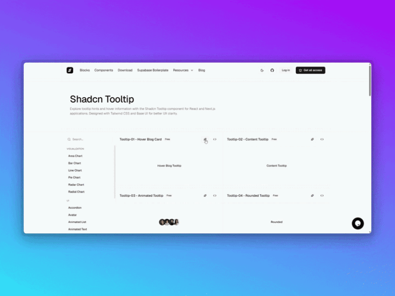
CLI installation: Install all the components below using pnpm, npm, Yarn, or Bun.
Code copy and paste: Add the component source directly to the project.
Copy prompt: Use a prompt-based workflow to generate or add the component.
Shadcn MCP: Use the Shadcn MCP workflow to discover and install the Tooltip component through an AI-assisted development workflow.
Tooltip Anatomy
All these Shadcn Tooltips combine a trigger, content, and provider to create a complete tooltip experience as below:
Tooltip
├── TooltipProvider
└── Tooltip
├── TooltipTrigger
└── TooltipContent
Note: Shadcn Tooltip requires TooltipProvider in the appropriate root layout or component tree before using individual tooltip instances.
Here are the best Shadcn tooltip components
These Shadcn Tooltip examples show different ways developers can use tooltips for contextual information, previews, shortcuts, validation states, navigation, and interactive UI elements. All these examples below cover both common interface patterns and more specialized implementations.
Image card tooltip
An image card tooltip provides a visual preview with supporting information when users hover or focus on an element. It can reveal extra content without requiring users to open a separate page or panel.
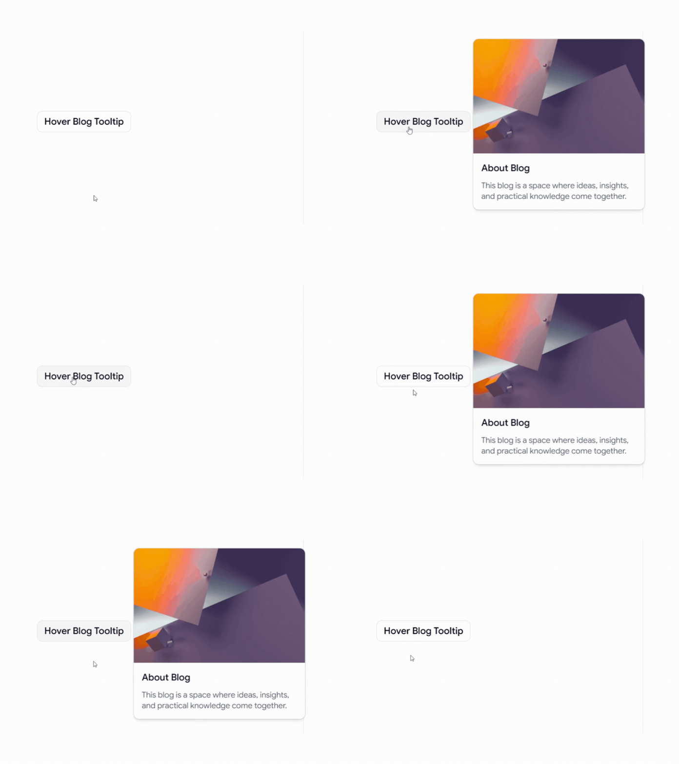
Use cases:
Blog post previews with thumbnails and short descriptions
Product previews with images and basic details
Content discovery in media or editorial interfaces
Portfolio items with additional project information
Best For: Blogs, content platforms, portfolios, and product interfaces.
Content tooltip
A content tooltip displays short explanations or supporting information when users interact with a specific UI element. It works well when additional context is useful but does not need to remain visible.
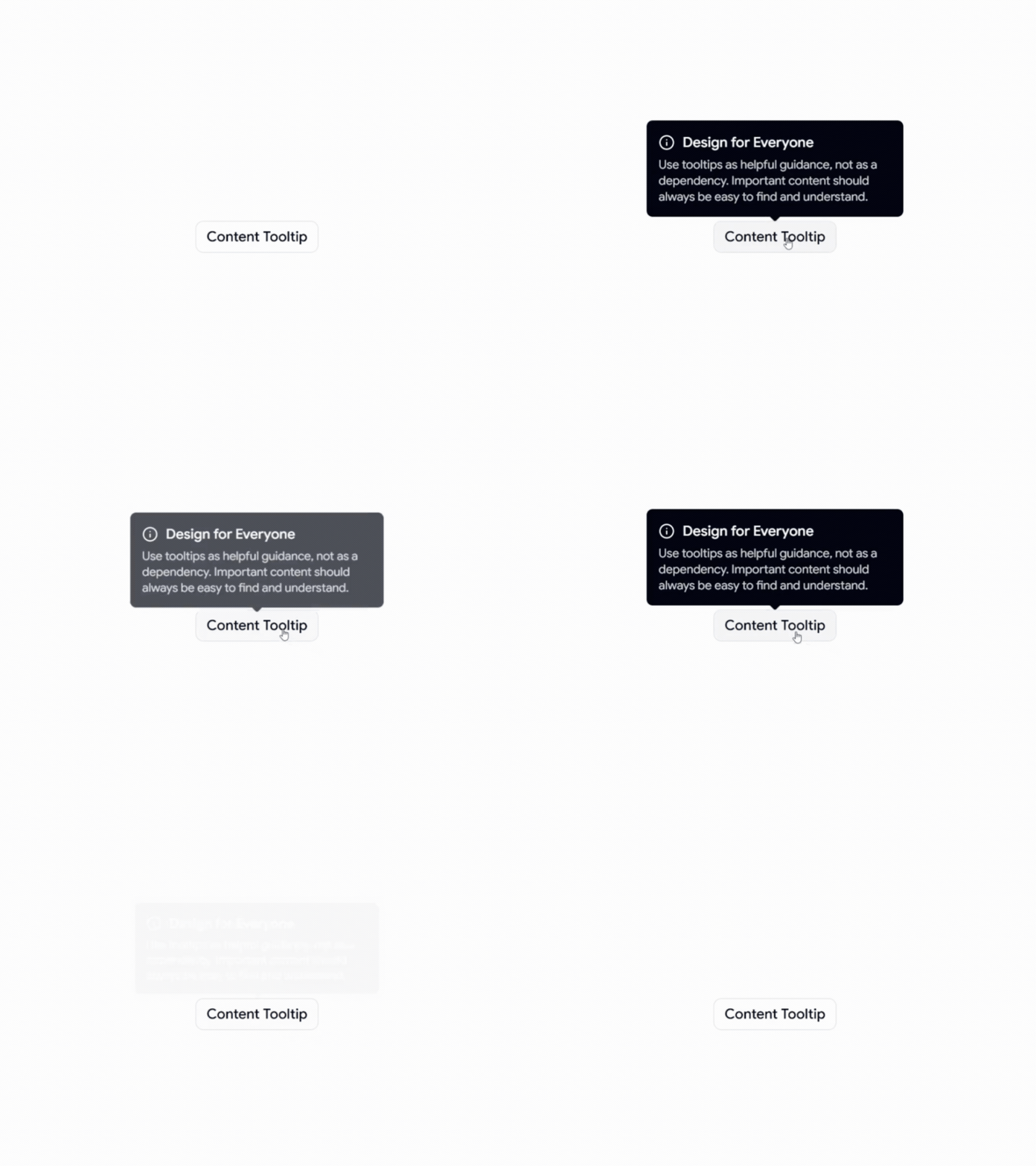
Use cases:
Form field explanations for unfamiliar inputs
Dashboard metrics with additional definitions
Abbreviations and technical terminology
Navigation labels for icon-based interfaces
Best For: SaaS dashboards, forms, admin dashboards, and data-heavy applications.
👉 Read the full Article Here → https://wrappixel.com/blog/shadcn-tooltips
Key Takeaways
12+ production-ready Shadcn Tabs built on React, Next.js, Tailwind CSS, and Framer Motion.
Some tabs are free and support both Radix and Base UI primitives.
Install any tab with a single CLI command using pnpm, npm, yarn, or bun.
The code copies directly into your project: no black-box packages, no hidden dependencies.
Several tabs include a copy prompt functionality you can paste into V0, Lovable, or Bolt.
Each entry below includes real use cases and a clear “Best for” line.
Why do most tab examples break in production?
A ticket lands for a tabbed settings page. Before you know it, you are deep in keyboard navigation, focus trapping, active indicator timing, and Framer Motion config all for something that looked like two hours on the board but ends up closer to a full day.
Most tab examples stop at a basic two-panel switch. No real accessibility, no smooth animation, and no production-tested layout behavior. That works fine for a demo but falls apart fast when you need icon triggers, badge counts, a vertical layout, or an animated indicator that does not cause layout shift once the app goes live.
Every tab on this list runs on React, Next.js, Tailwind CSS, and Framer Motion. Some are free. Each one supports Radix or Base UI primitives, so keyboard handling and ARIA roles come built in. You pick a tab, run one CLI command, and the code lands directly in your project.
What is a Shadcn Tab?
A Shadcn Tab is a tab component built on the shadcn model: the CLI copies readable source files into your project instead of hiding them inside an NPM package. You own the code outright: rename props, adjust Tailwind classes, refactor logic without worrying about breaking upstream dependencies.
Under the hood, each tab uses Radix or Base UI primitives for state, focus management, and ARIA roles. Keyboard navigation and screen reader support come baked in. You spend your time on the parts that actually need your attention: styling, layout, and behavior. The official shadcn/ui Tabs documentation covers the base API if you want to go deeper.
Tabs Anatomy (Composition)
Use the following composition to build a tab:
Tabs
├── TabsList
│ ├── TabsTrigger
│ └── TabsTrigger
├── TabsContent
└── TabsContent
Tabs Holds the state. TabsList wraps the clickable triggers. Each TabsTrigger maps to one TabsContent panel. Match the value on each trigger to its content block, and the switching logic handles itself.
Best Shadcn Tabs Components and Examples
We handpicked these Shadcn Tabs components and examples based on real-world usability, accessibility, animation quality, developer experience, and production-ready performance.
Animated Tab
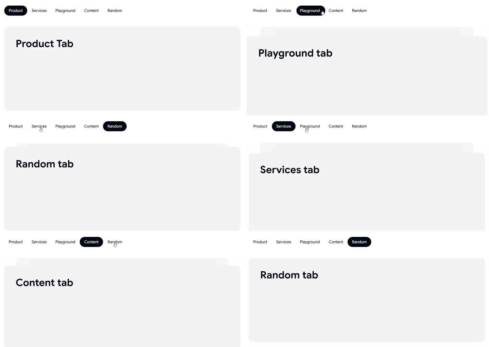
This tab uses a Framer Motion indicator that slides under the active trigger as you switch views, so the transition reads as one continuous motion rather than a hard cut. State sits on Radix primitives, which keeps keyboard arrows and focus order intact without any extra wiring. You retheme the indicator with a single Tailwind class, and panel content swaps without causing layout shift.
Use cases:
Analytics dashboards with multiple metric views
Product settings split across profile, billing, and team
Reporting screens toggling daily, weekly, and monthly data
Feature comparison panels on a pricing page
Multi-step review flows before a final submit
Best for: SaaS dashboards needing smooth, accessible metric view switching.
👉 Read the full Article Here → https://wrappixel.com/blog/shadcn-tabs
Sidebars are not just navigation; they define how users interact with complex UI systems. Most production dashboards built with React and Next.js use a scalable sidebar. It helps manage routing, permissions, and persistent layouts.
We evaluated these sidebar implementations based on:
Component composition and reusability
State handling and responsiveness
Accessibility and keyboard navigation
Fit into the Real World of SaaS Dashboards
This guide is for developers building SaaS dashboards, admin panels, or internal tools using Next.js or React. If you’re looking for a responsive retractable sidebar or deciding how to structure navigation without breaking UX at scale, this will help. You will learn which sidebar pattern fits your layout, data, and user flow.
What is a Shadcn Sidebar?
A Shadcn sidebar is a composable, config-driven navigation system built using shadcn/ui and Tailwind CSS. It is often used in React and Next.js admin dashboards.
It is not just a visual navigation vertical panel. It acts as a persistent layout boundary, a route-aware state layer, and often an RBAC filtering surface. In production SaaS apps, the sidebar directly affects scalability, rendering performance, layout persistence, and how cleanly we can separate navigation logic from presentation components.
For developers seeking ready-made components and structured patterns, explore our curated guide to Shadcn UI libraries to accelerate the development of scalable dashboards.
Before choosing or implementing a sidebar pattern, developers should evaluate architectural constraints, such as navigation depth, expected item scale, responsiveness strategy, and whether routing and role logic are static or dynamic.
Most scalable implementations follow a config-first structure in which navigation is stored as structured data, mapped to UI components, highlighted via the router’s pathname, and wrapped in a shared layout to avoid duplication. The table below combines strategic questions with implementation principles to help you make an architecture-level decision rather than just a UI choice.
How the Shadcn sidebar works in a Next.js App
In a typical Next.js App Router setup:
app/
├─ (dashboard)/
│ ├─ layout.tsx
│ ├─ page.tsx
The sidebar lives inside layout.tsx, ensuring it persists across route changes. Navigation is usually defined in a config file and dynamically mapped to sidebar components. This avoids duplication and keeps routing logic centralized.
Best Shadcn Sidebar Examples
When implementing these Shadcn sidebar patterns, memoise navigation trees, avoid inline functions in maps, and ensure keyboard accessibility with focus management and aria attributes.
Admin Dashboard Sidebar

A navigation system with nested routes and grouped menus, scaled fully into multi-layer dashboards, addresses complex information architecture problems without overwhelming users. In any sidebar-supported navigation pattern, icons are available for all nodes, and sections can be collapsed.
This system is designed for applications where deep hierarchies are more important than simplicity. Moreover, it is a free and open-source shadcn sidebar with Figma design.
Key features:
Multi-level navigation with collapsible groups
Icon + label mapping for quick scanning
Ideal for RBAC-based dashboards
Works well with layout persistence
Best for: SaaS analytics dashboards, CRM systems.
Explore Admin Dashboard Sidebar
Mini Sidebar Navigation

A collapsed-first sidebar that prioritizes screen real estate while keeping navigation accessible through icons. Expands on interaction, making it suitable for dense dashboards where content space is critical. Reduces visual noise without sacrificing usability.
Key features:
Icon-only default with hover/expand behavior
Space-efficient layout for data-heavy screens
Smooth transition states
Minimal cognitive load
Best for: Trading dashboards, data visualization apps.
Explore Mini Sidebar Navigation
Check out the Full Article - https://wrappixel.com/blog/shadcn-sidebar

-
1
I'm curious what made you evaluate sidebar patterns as an architectural decision rather than a UI component.
Was there a point where you found that navigation structure was shaping the application more than the interface itself?

Modern React applications rely on date selection components for everything from booking systems and scheduling platforms to analytics dashboards and admin panels. A Shadcn Date Picker provides a flexible, accessible, and customizable solution built with React, Tailwind CSS, and TypeScript.
In this guide, we tested and reviewed production-ready Shadcn Date Picker components covering single date selection, Date & Time Pickers, Date Range Pickers, Time Pickers, and Multi-language Date Pickers. Each component was evaluated for Next.js compatibility, React Hook Form integration, accessibility, customization, and real-world production readiness to help developers choose the right solution for their projects.
How We Tested These Components
We installed and tested each react date picker in a modern Next.js App Router project to verify real-world compatibility.
We validated every component for:
Installation inside Next.js App Router
Tested with strict TypeScript mode enabled
Controlled and uncontrolled usage patterns
Integration with react-hook-form
Date range and datetime behavior
Timezone handling (where supported)
SSR and hydration safety
Dependency footprint (react-day-picker, date-fns, etc.)
GitHub activity and maintenance status
We only included components that are actively maintained, reusable, and production-ready.
All components listed here are 100% free and open source.
Across the list, you’ll find support for five common date selection patterns:
Date Picker – Select a single calendar date.
Date & Time Picker – Select both the date and time in a single component.
Date Range Picker – Choose a start and end date to filter or book.
Time Picker – Select hours and minutes without displaying a calendar.
Multi-language Date Picker – Display localized calendars and regional date formats for global applications.
When should you use a Shadcn date picker
Shadcn date pickers are ideal for:
SaaS analytics dashboards for filtering data by date
Booking and scheduling systems – for single or range date selection
Admin panels with reporting filters
Financial tools that analyze data-based metrics
CRM systems that track activity history
Any application already using shadcn/ui and Tailwind CSS
Check Out the Full Article - https://wrappixel.com/blog/shadcn-date-picker

Calendars are more than date pickers.
They help users book appointments, schedule meetings, hotel booking, manage events, track deadlines, select dates, and organize daily workflows.
A well-designed calendar improves the entire user experience by making date selection fast, clear, and intuitive.
If you’re building a SaaS product, booking platform, HR system, CRM, project management tool, healthcare application, or admin dashboard, choosing the right calendar component can save hours of development time.
In this collection, you’ll discover calendar components for booking platforms, appointment schedulers, event management systems, travel applications, and admin dashboards. From simple calendar components to advanced schedulers with range selection and timezone support, these examples can help you build modern React and Next.js applications faster.
We evaluated these calendar examples based on:
Developer experience
Booking and scheduling use cases
Customization flexibility
Responsive layouts
Accessibility
Production-ready implementation
Real-world application support
Whether you need a lightweight calendar or a complete scheduling solution, you’ll find examples that fit almost every project.
Why Use Shadcn Calendar Components?
Calendar components are used across many modern web applications.
Instead of building date selection logic from scratch, these ready-made examples let you focus on your application’s business logic.
Common use cases include:
Hotel and travel booking
Appointment scheduling
Healthcare reservation systems
Event management
Team scheduling
HR leave management
SaaS dashboards
Project planning
Meeting planners
Rental platforms
Restaurant reservations
Explore the Best Shadcn Calendar
We’ve handpicked 20+ Shadcn Calendar examples built with React, Next.js, Tailwind CSS, and Base UI. Each example focuses on a different scheduling or date selection use case, making it easier to find the right calendar for your application.
Standard Calendar
A clean and minimal calendar component built for everyday date selection, scheduling, and planning. Its familiar layout makes it easy for users to browse months, choose dates, and manage schedules without distractions. This component integrates well into forms, dashboards, booking pages, and productivity applications.

Key Features
Single date selection
Responsive monthly calendar view
Keyboard-friendly navigation
Easy React integration
Customizable Tailwind styling
Best for: Booking forms, dashboards, profile settings, productivity apps.
Basic Calendar
A lightweight date picker that’s easy to integrate into forms, filters, dashboards, and simple scheduling workflows.

Key Features
Simple date selection
Lightweight implementation
Form integration
Responsive layout
Easy React integration
Best for: Forms, dashboards, profile settings, admin applications.
Check Out the Full Article - https://wrappixel.com/blog/shadcn-calendar-examples

A good combobox can make a big difference in how users interact with your landing page, website or app.
Whether you’re building forms, web pages, dashboards, admin panels, or SaaS products, searchable dropdowns help users find and select options faster while keeping the interface clean and easy to use.
Most developers start with a traditional select component. While it works well for a small number of options, usability often declines as the list grows. Users spend more time scrolling, finding specific items becomes difficult, and forms start to feel less efficient.
That’s where a Shadcn Combobox becomes a better solution.
By combining a input components with a dropdown menu, a combobox helps users find and select options faster while keeping interfaces clean and accessible.
In this collection, you’ll discover some of the Best Shadcn Combobox components for modern React and Next.js applications, including:
Searchable dropdowns
Country selectors with flags
User selection comboboxes
Multi-select checkbox comboboxes
Timezone pickers
Virtualized comboboxes for large datasets
Linear-inspired combobox patterns
Advanced filtering interfaces
Whether you’re building a SaaS dashboard, admin panel, onboarding flow, or customer-facing application, these combobox patterns can help improve both usability and efficiency.
Let’s Explore the Best Shadcn Combobox Components
In this blog, we’ll explore 17 real-world Shadcn Combobox examples that demonstrate how searchable dropdowns can improve user experience, simplify complex selections, and create faster workflows in modern web applications.
Basic Combobox
This component provides a simple and familiar way for users to search and select options from a dropdown list. Instead of scrolling through long menus, users can quickly find what they need using the built-in search functionality.

It’s a great starting point for applications that need a clean, lightweight, and easy-to-use selection component.
Key Features
Searchable dropdown interface
Fast option filtering
Keyboard accessible
Lightweight and easy to customize
Ideal for forms and settings
Best For: This component is ideal for forms, settings pages, account preferences, dashboard configurations, onboarding flows, and applications that need a simple searchable dropdown without additional complexity.
Popover Combobox
This component displays the dropdown inside a popover, helping keep the interface clean while saving space on the page. Users can search and select options without leaving their current workflow, making interactions feel faster and more organized.

The compact design works especially well in dashboards and applications where screen space is limited.
Key Features
Popover-based interaction
Search and filter support
Compact UI design
Clear selection feedback
Works well in dashboards
Best For: This component is ideal for admin dashboards, settings panels, project management tools, data tables, and applications that need a space-efficient selection experience without cluttering the interface.
Click Here for Full Detailed Blog - https://wrappixel.com/blog/shadcn-combobox-components
Key Takeaways
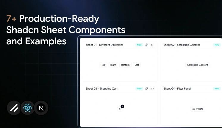
Shadcn Sheet is a slide-over panel component built on Radix UI and Base UI primitives, installed via CLI using pnpm, npm, yarn, or bun.
Each component uses a direct copy-paste approach, compatible with AI-assisted tools such as V0, Lovable, and Bolt.
The components covered here were evaluated based on real UI usage in SaaS products, developer workflow speed, accessibility support, animation behavior, and production readiness.
Choosing the wrong panel type (Sheet vs. Drawer vs. Dialog) causes UX and focus management problems that are hard to fix after launch.
Slide-over panels look straightforward until you need to handle dynamic content, nested focus, and mobile responsiveness. Most developers install a basic sheet component, ship the demo code, and spend the next sprint fixing layout shifts and keyboard navigation bugs.
This guide skips the basic setups. We break down production-tested Shadcn Sheet patterns built on React, Next.js, Tailwind CSS, and Framer Motion. You will get the exact copy-paste code for complex workflows, a performance comparison, and a clear framework for choosing between sheets, drawers, and dialogs.
Each pattern is optimized for accessibility, responsiveness, and seamless integration into modern web applications.
What is a Shadcn Sheet?
A Shadcn Sheet is a slide-over panel component that renders content in a layer that slides in from one edge of the viewport. It stays anchored to the screen edge while the main content remains visible behind it. This makes it different from a modal or dialog, which takes full focus and blocks the page.
Shadcn Sheet is built on Radix UI and Base UI primitives, which handle focus trapping, keyboard navigation, and ARIA attributes out of the box. You don’t wire those up manually.
Sheet Anatomy (Composition)
The component ships as a composable set of parts you assemble:
Sheet ├── SheetTrigger └── SheetContent ├── SheetHeader │ ├── SheetTitle │ └── SheetDescription └── SheetFooter
You get the trigger, the content wrapper, the structured header and footer slots, and the overlay. Each part is independently composable, so your team can customize the layout without fighting a monolithic component.
For setup, you can read the official shadcn/ui Sheet documentation or follow the getting started guide to configure the CLI for your project.
When to use a Shadcn Sheet
Not every contextual overlay belongs in a Sheet. Using one in the wrong place creates confusing focus behavior, awkward mobile layouts, and UX patterns that don’t match user expectations.
Use a Sheet when:
The content is supplemental, and the user may need to reference the main page while it’s open.
The action doesn’t require a hard decision before the user continues (for example, a filter panel or a cart preview).
The panel contains a list, form, or scrollable content that benefits from a full side column.
You want persistent access without navigating away from the current route.
Avoid a Sheet when:
You need the user to confirm or cancel a destructive action. A dialog is the right choice there.
The content is short enough to fit in a tooltip or popover.
You’re on mobile, and the panel competes with swipe gestures. A drawer from the bottom performs better in those scenarios.
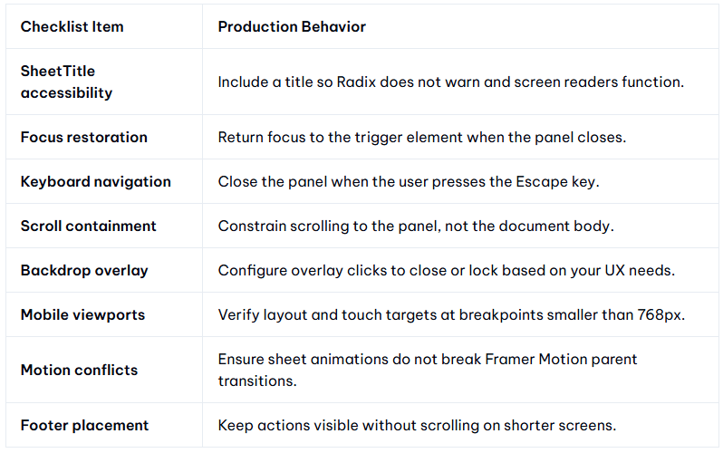
Developer Checklist
Before shipping any Sheet component to production, run through this list:
Quick Comparison Table
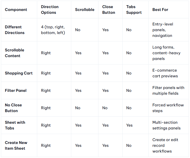
Best Shadcn Sheet Components and Examples
We evaluated these shadcn sheet components based on real UI usage in SaaS products, accessibility support, animation quality, developer workflow speed, and how well each holds up under production conditions.
Different Directions
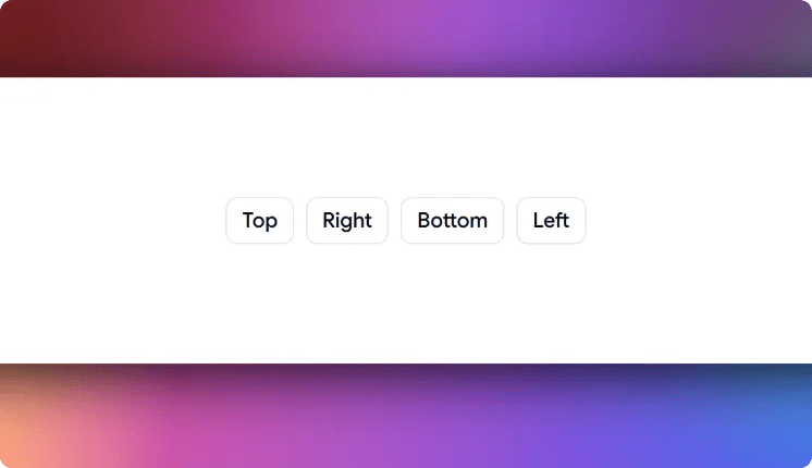
This Sheet gives you 4 directional variants in a single component: top, right, bottom, and left. Most sheet implementations lock you into one direction and require a prop-drilling workaround to change it. This one ships all 4 out of the box, each with its own enter and exit animation managed through Framer Motion. The layout adapts based on the chosen direction without custom CSS overrides.
Use cases:
Right-side navigation panels in admin dashboards
Bottom sheet patterns for mobile filter drawers
Left-side context panels for document editors
Top notification or announcement banners that slide down
Multi-directional onboarding overlays in SaaS tools
Best for: Directional slide-over panels in multi-layout apps.
Scrollable Content
This sheet is built for panels that carry more content than the viewport can show at once. Scroll is scoped to the panel interior, so the document body stays locked while the Sheet is open. This solves the scroll bleed problem that appears in long settings forms or multi-section review panels when scroll isn’t properly contained.
Use cases:
Long onboarding forms with multiple input sections
Legal terms or policy review panels before submission
User profile edit sheets with grouped preference sections
Notification history panels in product dashboards
Extended data review panels before confirming an action
Best for: Long-form content that exceeds viewport height.
Explore production-ready ShadCN Sheet examples for your React projects. - https://wrappixel.com/blog/shadcn-sheet-examples
-
1
One thing that stood out is that the value isn't really the Sheet components themselves.
Developers can already find dozens of implementations. What's harder to find is confidence that a pattern will hold up in production without creating accessibility, focus, or UX issues later. That feels like the real product you're building, and I'd lean into that distinction more than the components themselves.
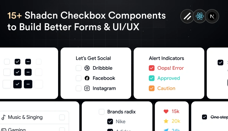
Checkboxes are a simple UI component, but they have a big impact on usability.
They make it easy for users to select options, complete forms, and manage settings without extra effort.
A good checkbox should be easy to see, easy to use with a keyboard, and easy to change for different needs. Since Shadcn uses React, Tailwind CSS, Base UI and Radix UI, you can build checkbox styles without starting from zero.
In this collection, we picked useful Shadcn Checkbox components for React and Next.js projects.
From simple checkboxes to tree views and avatar selection, these components can save time and keep your UI clean.
Why Developers Choose Checkbox Components
Shadcn Checkbox components are more than simple form controls.
They are built to be easy to use, easy to style, and easy to fit into different react projects.
Some of the biggest advantages include:
Built with React and Tailwind CSS
Based on Radix UI parts that work well with keyboard and screen readers
Easy to change with Tailwind classes
Works with different React state setups
Fits well with React Hook Form and Zod
Good for Next.js apps
Light and ready for real projects
Whether you’re building a SaaS dashboard, CRM, ecommerce platform, or admin panel, these components can fit into many kinds of projects.
Let’s Explore Shadcn Checkbox Components
To help you save time, we’ve collected useful Shadcn Checkbox examples for React and Next.js. Each one is made for a different use case, so you can pick the right checkbox for your UI.
Default Checked Checkbox
This checkbox component comes selected by default when the page opens. It can help when you want to turn on a recommended option right away, like default settings or optional updates.

It can also reduce extra clicks while still letting users change the choice later.
Selected by default
Easy to manage with React state
Works with forms and settings pages
Supports keyboard use
Easy to style with Tailwind CSS
Best For: Use this component for onboarding flows, default settings, subscription options, and forms where one choice is usually turned on.
Disabled Checkbox
This checkbox component shows an option that users cannot click. It can help when a feature is not available yet, depends on another setting, or is blocked by permissions.
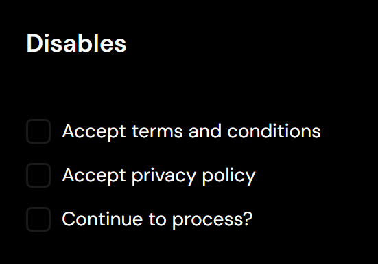
Instead of hiding the option, it shows users that the choice exists but is not ready to use.
Prevents user interaction
Shows unavailable options
Supports disabled styling
Works with permission-based screens
Keeps layouts consistent
Best For: Use this component for admin dashboards, enterprise apps, permission screens, and forms with locked options.
Here are all the Shadcn Checkbox examples that developers can use in real projects - https://wrappixel.com/blog/shadcn-checkbox-examples
Looking for the Best Shadcn Forms for Your Next React or Next.js Project ?
This list includes 15 Shadcn Form templates, components, and examples
Multipurpose input form
This is more than a basic input form. Along with standard fields like email and phone number, it includes commonly used form components such as file upload, checkbox, radio buttons, and toggle switches, making it a complete starting point for many dashboard workflows.

Shadcn Edit Form
This Shadcn form template brings all these fields together in a clean layout.

Here are All the 15 Shadcn Form examples & templates developers can use in real projects - https://wrappixel.com/blog/shadcn-forms


Comment